Why Decorating With Beige Belongs In Every Home
Beige is not one color; it is a whole family of warm, versatile tones. Here is everything you need to know about decorating with beige, from undertones to color pairings.
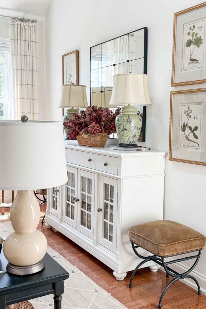
I have always been a huge fan of beige. It gets called boring more than any color deserves to be called boring, and I think that reputation is simply wrong.
What I love about beige is what it does for a room before anything else even shows up. It fills backgrounds with softness. It creates a canvas that lets every other color play nicely together. Beige is the backbone of good design, not its absence.
When we first moved to Tanglewood House, our palette was almost entirely beige. It felt safe, and with so many windows filling the rooms with light, it felt right for where we were. As we settled in and got comfortable with our open-concept home, our color story kept evolving, and through it all, beige stayed. It became our warm, consistent thread, the color that everything else in our home gets to lean on.
That is really what decorating with beige is about. It is not one flat, forgettable shade. It is a whole family of warm, adaptable tones that can carry a room quietly or step back and let other colors shine. Here is everything you need to know to decorate with beige confidently in your own home.
Why Decorating With Beige Is Having A Real Moment
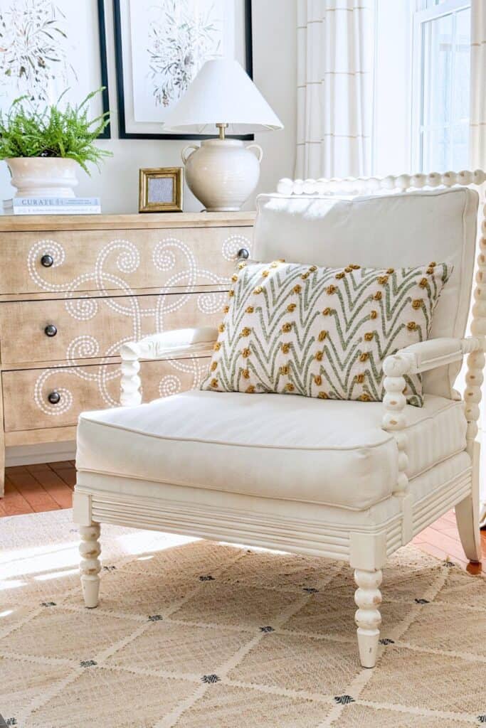
Thank goodness the long, gray decade is finally behind us. We are moving back toward warmth, light, and softness in our homes, and beige is very much a part of that shift.
Here is the thing, though. Beige never actually left. It has always been a classic. What is happening now is not so much a comeback as a rediscovery, a return to a color that quietly worked all along while gray took the spotlight for a while.
Gray has its place, and it can be gorgeous. It adds wonderful depth and drama used as an accent, in an ottoman, a piece of art, a moody paint color on a single wall, or a piece of furniture. But gray was never meant to be the primary color for an entire home. It is a supporting player, not the lead.
Beige, on the other hand, is built for that lead role. It is warm where gray is cool, inviting where gray can feel a bit clinical, and it has centuries of staying power. So welcome back, beautiful, useful beige. It is good to have you carrying our homes again.
A Brief History Of Beige
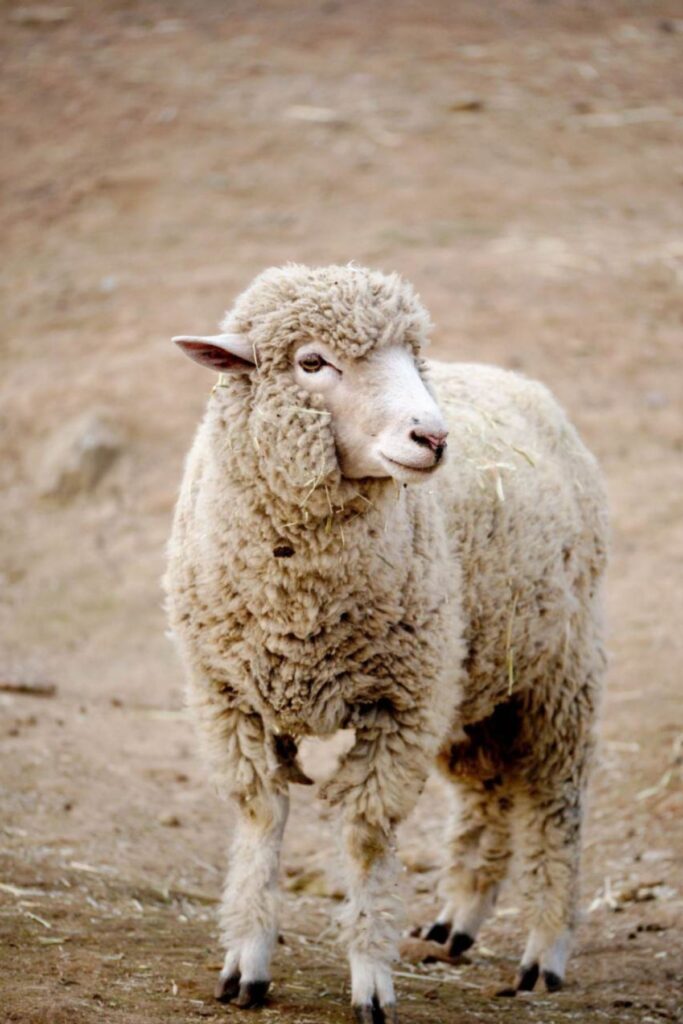
Beige is a French word meaning the color of natural wool, not washed, bleached, or dyed, but wool just as it comes off the sheep. That makes me think of a sheep standing in a field, and if you have ever actually seen sheep in a field, their wool is never one single color. It is full of soft variation, exactly like beige itself.
That same idea shows up in another common use of the word. Beige has also come to describe the color of a bleached bone, another natural material that is never quite one flat shade. Between the wool and the bone, you start to see the pattern. Beige has always described something found in nature first, and a paint color second.
🌿 TIP BOX: Next time you are choosing a beige, think of it the way the French originally did, as a natural material rather than a flat color. It will help you notice subtle variations instead of expecting a single, uniform shade.
French Beige
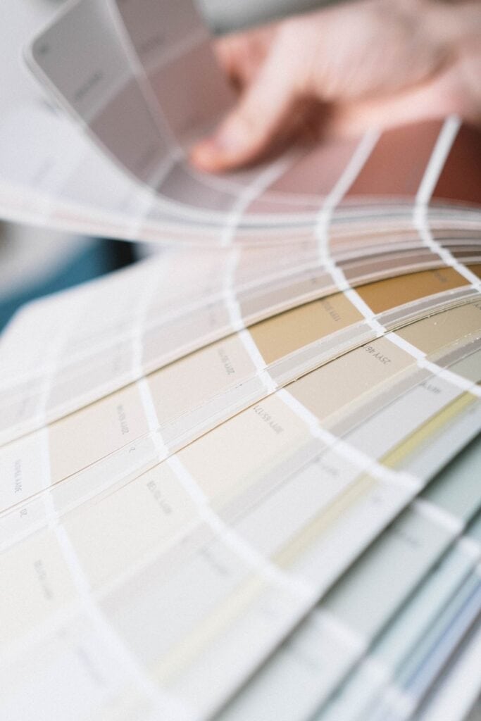
Beige probably has thousands of variations, from the palest, warmest white, through cream, ecru, buff, linen, tan, cafe au lait, and khaki, all the way to toasty shades that edge close to brown.
That range exists because of how beige is actually made. It comes from mixing brown and white pigments together, sometimes with a touch of gray or yellow added in. And since brown itself is a mix of the primary colors blue, yellow, and red, you can see why beige is not nearly as simple as it looks. A small shift in any one of those underlying colors changes the whole personality of the beige.
So if we want a simple, working definition, basic beige is white with a touch of brown mixed in. Everything else- the greige, the taupe, the deeper, moodier shades- comes from what else gets added to that base.
Here is the part that matters most for how you decorate with it. Beige, at its most elemental, is a warm color. But almost no color can be fully described without talking about its undertone, and beige is no exception. That is exactly where we are headed next.
🌿 TIP BOX: When two beiges look almost identical side by side, the difference almost always comes down to undertone, not the amount of brown or white in the mix. That is the piece worth understanding before you paint an entire room.
Finding Undertones In Beige
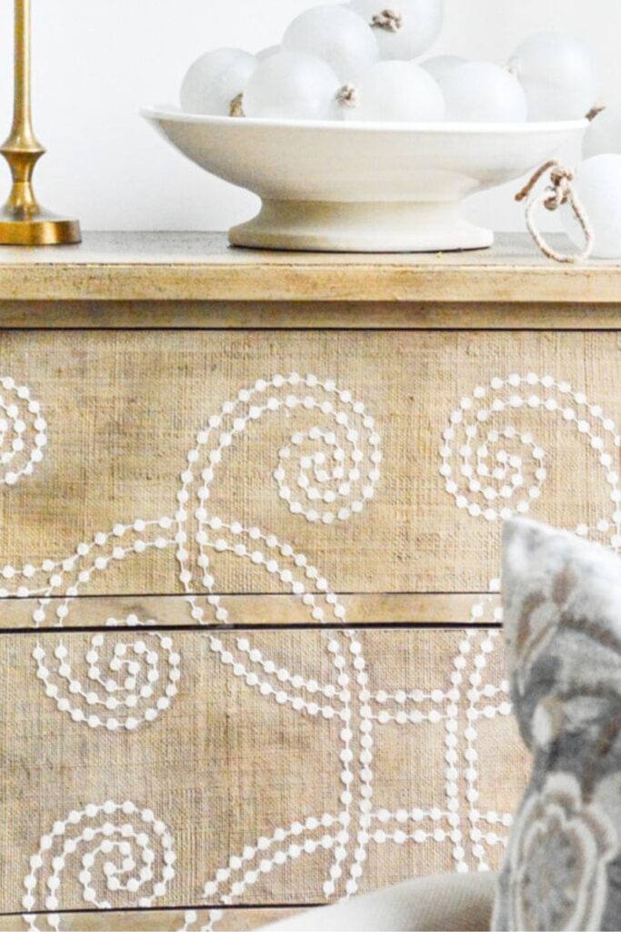
Finding an undertone can feel a bit like detective work. If you are struggling to see it, hold the beige up against a plain white piece of paper. That contrast will often reveal exactly what has been hiding underneath all along.
If the beige you are working with is a paint color, you have an easier path. Most paint companies publish undertone information and hex numbers for their colors, so you do not have to guess.
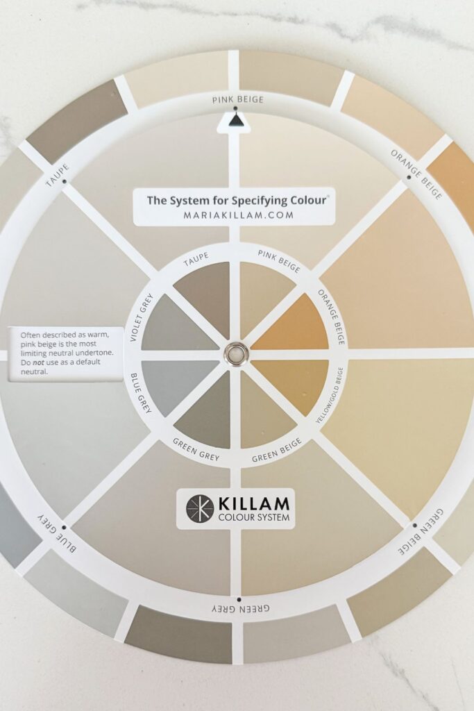
Once you know the undertone in your favorite beige, you know exactly which colors will complement it beautifully in your home, and just as importantly, which ones will fight against it.
🌿 TIP BOX: Do not rely on a paint chip alone to judge an undertone. Undertones shift with your home’s lighting, so always test a sample directly on your own wall before committing.
Warm Or Cool
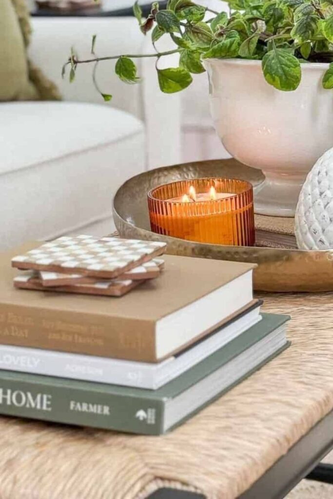
Beige is a warm color at its core, but that does not mean every beige behaves the same way once it lands on your walls or furniture. Two beiges can look nearly identical on a paint chip and then read completely differently once they are actually living in your home. Beige truly can work with almost any color and any style, but it looks its best and feels most at home when we take undertone into account rather than assuming any beige will simply get along with anything.
Beige And How It’s Undertone Work With Other Neutrals
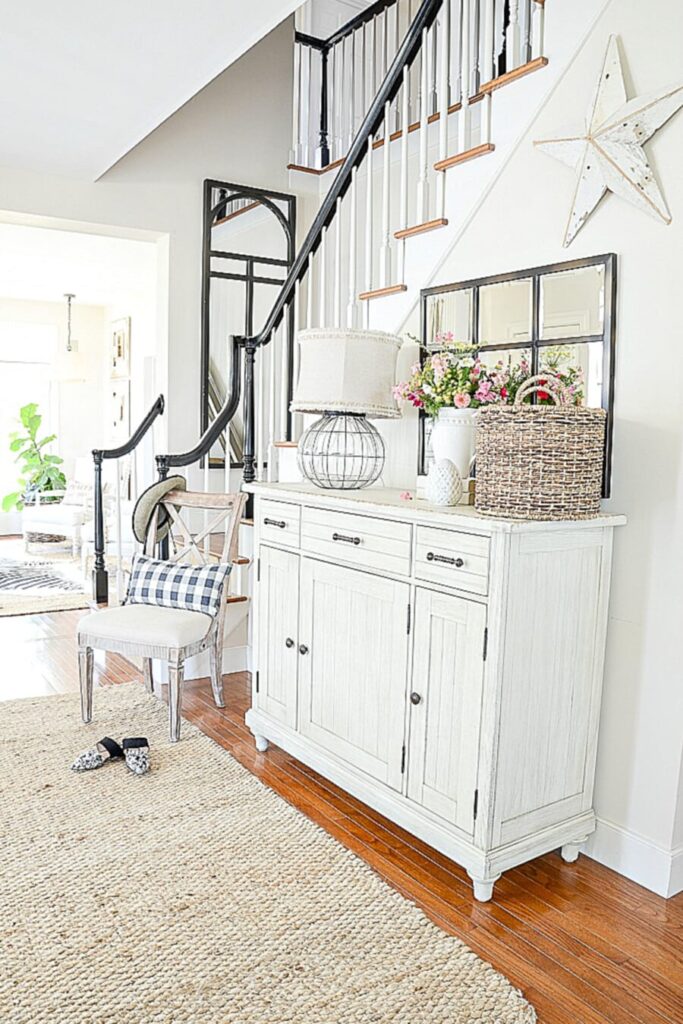
We painted the walls of our StoneGable home in my favorite beige paint color at the time, Benjamin Moore Sonnet. In our home, this wall color read about as beige or bone as you could get in daylight. But here is how it looked on the paint chip.
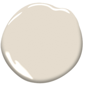
That is why it is so important to paint multiple samples directly on your own walls before committing to a color, isn’t it?
Here is what I learned from the paint chip that I could not fully see on my Sonnet-painted walls. Sonnet’s beige carries a subtle yellow undertone that borders on the peach spectrum. It is so delicate that you might only detect the faintest hint of peach or pink in it, yet even that tiny amount can shift a beige significantly.
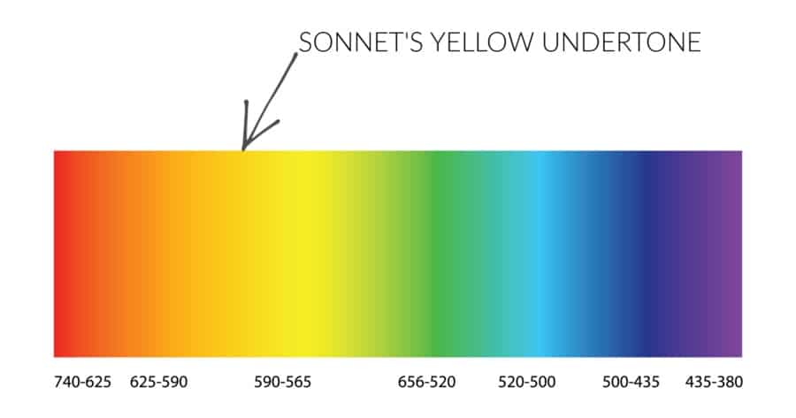
All of the trim in our StoneGable home was painted Atrium White, and I loved Sonnet paired with it. No wonder, since Atrium White has the tiniest undertone of pink. The undertones in Sonnet and Atrium White genuinely loved playing together because they shared that same soft warmth underneath.
🌿 TIP BOX: When two colors share even a whisper of the same undertone, they will almost always feel harmonious together, even if they look quite different at first glance.
Our Color Story Since Then
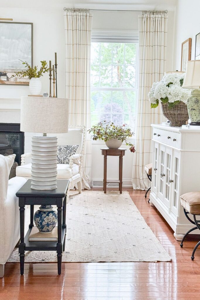
Our color story has shifted since those StoneGable days. Beige is no longer on the walls here at Tanglewood House. These days, our walls wear a warm-ish white, Simply White by Benjamin Moore. Benjamin Moore describes Simply White as having soft yellow undertones that give it a bright, clean, and warm look, with a Light Reflectance Value of 89.52, meaning it reflects a great deal of light and helps a space feel open and glowing. Which it really does!
Knowing that, undertone matters just as much now as it did with our beige walls at StoneGable. Because I understand the warm yellow undertone running through our walls, I keep most of the beige tones throughout our home warm as well, so everything continues to feel connected rather than working against each other.
The swivel chair in our living room is a good example. It is upholstered in a fine check woven from light beige and warm greige, and both tones sit comfortably alongside our warm white walls although it leans slightly cooler than many of the other items in this room. It still works because it’sthe room another interesting beige.
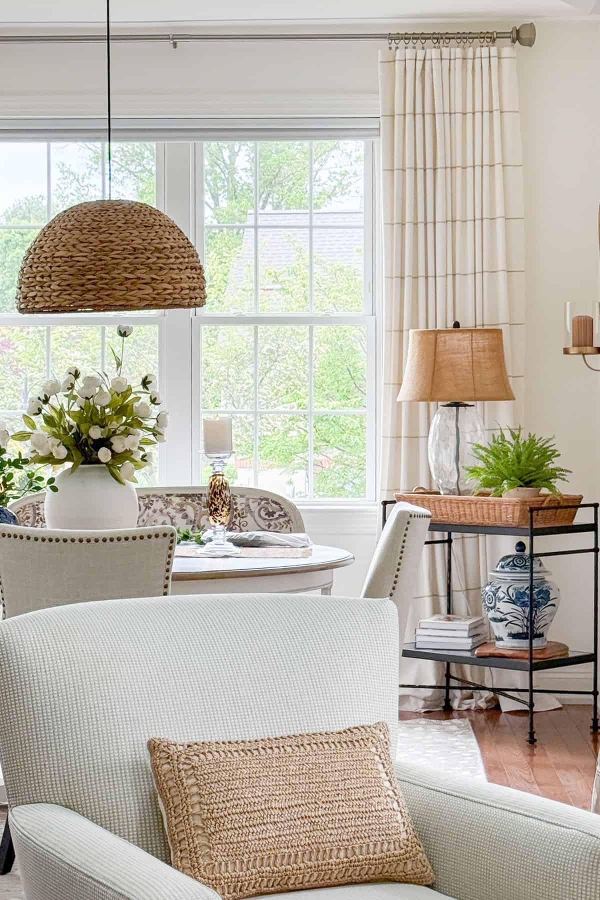
This is really the heart of decorating with beige well. It is not about beige getting along with everything by default. It is about noticing the undertones in your walls, furniture, and accessories, and choosing beiges that share the same underlying warmth. Some undertones love being together and look beautiful. Others fight like cats and dogs and can make an entire room feel off, even when the colors themselves seem like they should work. Knowing your undertones is what separates a room where beige simply exists from a room where beige truly works.
🌿 TIP BOX: If you have moved away from beige walls but still love beige in your furnishings, do what I do. Match the undertone of your new wall color instead, and your beige pieces will still feel completely at home.
Beige Paint Colors To Know
Remember that sheep standing in a field from earlier, with wool that is never just one shade? Beige paint works exactly the same way. It spans an enormous range, from a beige so pale it reads almost off white, all the way to a deep, toasty tan that edges close to brown. There is no single beige, only a whole flock of them, and knowing where a color falls on that spectrum makes it much easier to choose the right one for your room.
Let’s walk through that spectrum from lightest to deepest, starting with the palest beiges in the flock.
Light Beige Paint Colors
These sit toward the paler end of the flock, bright and airy, closer to the off-white side of the spectrum.
- Sherwin-Williams Accessible Beige, LRV 58, a light beige that leans a touch toward gray rather than the golden beiges of years past, especially pretty in a south-facing room
- Benjamin Moore Natural Linen, LRV 66, a soft orange undertone that stays subtle rather than heavy, sitting comfortably in the middle of the light range
- Sherwin-Williams Muslin, LRV 66.5, light and well balanced, with an orange undertone gentle enough that it does not swing yellow or pink the way some beiges can
- Benjamin Moore Manchester Tan, LRV 63, a charming, creamy light beige with a golden undertone, warm, clean, and pairs well with almost any wood tone
- Benjamin Moore Shaker Beige, a longtime bestseller with no gray in its undertone, so it stays true and warm rather than drifting cool
🌿 TIP BOX: If you are choosing between two light beiges and cannot decide, look at their LRV. Anything from the high 50s into the mid 60s tends to stay bright and airy without tipping into looking washed out or flat.
Why Some Whites Actually Read As Beige
Many of the colors we see labeled as white on a paint chip actually read as beige once they are living on a wall. This happens because our eyes do not perceive color in isolation. A white with even a small amount of yellow or gray mixed in will pick up warmth from natural light, from wood floors, from nearby furniture, and our eyes translate that warmth as beige, even though the can says white.
This is exactly why so many popular “whites” get mistaken for beige, and why some of the beiges we love get mistaken for white. The two categories sit much closer together than their names suggest.
- Sherwin-Williams Alabaster, sold and marketed as a white, but widely described as a soft, almost off-white with warm beige undertones
- Benjamin Moore Linen White, warmer and more layered than a true white, closer to a soft beige once it is on the wall
- Benjamin Moore White Dove, one of the most popular “whites” in the country, yet its yellow undertones mean it reads noticeably warm and creamy rather than crisp
- Sherwin-Williams Crème, shopped alongside true whites, though its name is a small hint at how warm it actually reads
🌿 TIP BOX: If a paint name includes words like white, linen, or dove, do not assume it will read crisp and cool. Undertone and lighting matter far more than the name on the can, so always judge with a sample on your own wall.
Medium Beige Paint Color
Moving a bit further into the flock, these are warmer and more grounded than the light beiges, but nowhere near as deep as true tan.
- Benjamin Moore Grant Beige, LRV 56.65, a genuinely moderate tan, not too light and not too dark, an easy, dependable middle ground for almost any room
- Benjamin Moore Stone Hearth, LRV 48.85, part of the Classic Color Collection, with more depth than the light beiges and just enough character that it can pull a soft gray in certain light, closer to a mid-toned taupe
- Sherwin-Williams Sandbar, a beige with a bit more presence than Accessible Beige, lovely for adding depth to a bathroom or accent wall without going fully dark
🌿 TIP BOX: A medium beige is often the most forgiving choice for a room with mixed lighting throughout the day, since it has enough depth to stay warm in shadow but is not so dark that it swallows light in the evening.
Deeper Beige And Tan Paint Colors
And at the far end of the flock, these are richer and more toasty, closer to true tan.
- Sherwin-Williams Accessible Beige at full strength versus a softer version diluted to 75 percent strength for trim, a nice way to keep walls and trim related without them competing
- Benjamin Moore Bennington Gray, richer and warmer with a lower LRV, worth watching for a green undertone depending on what you pair it with
- Benjamin Moore Alexandria Beige, a deep, rich beige that looks wonderful alongside reds, navy, and hunter green
🌿 TIP BOX: The deeper a beige gets, the more its undertone tends to announce itself. Always test a large sample of a darker beige on your actual wall before committing, since these shift the most between the paint chip and the room.
Using Contrasting Colors In A Beige Room
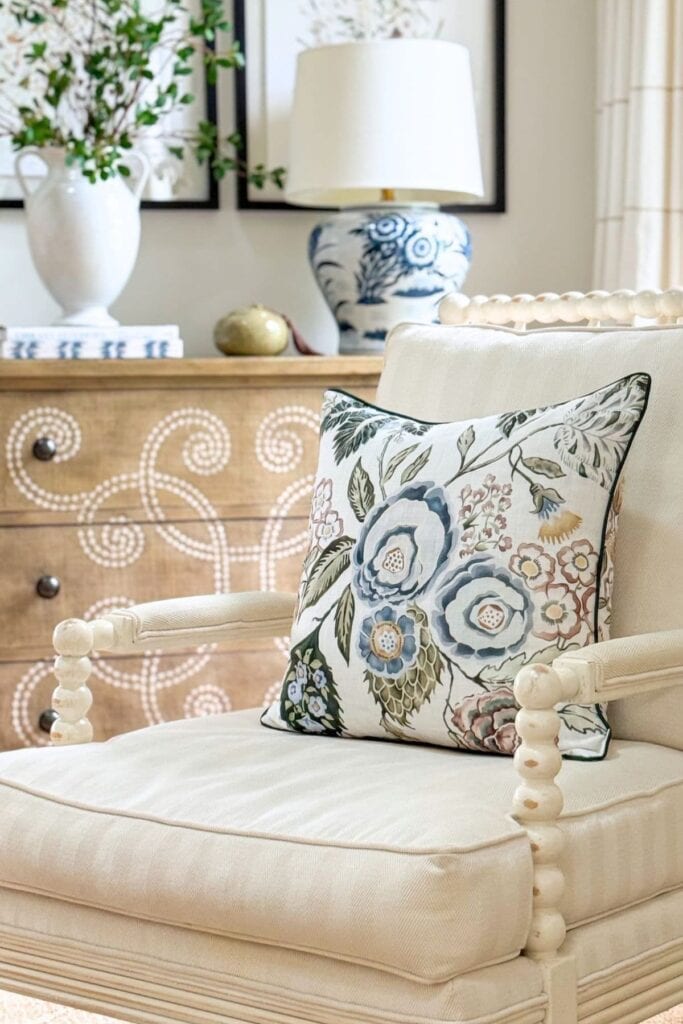
We have spent a lot of time talking about beige on walls, but decorating with beige is about so much more than paint. It shows up in furniture, textiles, and accessories just as often, and that is really where the fun of pairing colors begins.
In our own home, I mostly stay on the light end of the beige spectrum, in pillows, throws, upholstery, and rugs. Light beige gives a room that soft, airy feeling I love, and it also happens to be the most forgiving shade to pair with other colors, since it never fights for attention.
Adding a contrasting color to a room with plenty of beige is essential to prevent it from feeling dull, since a room filled with only warm or only cool tones can lack visual interest. Follow the 80/20 rule here. Let beige and other warm neutrals make up about 80 percent of the room, then bring in your contrasting color at around 20 percent, enough to add life without overwhelming the calm beige creates.
Beige And Blue
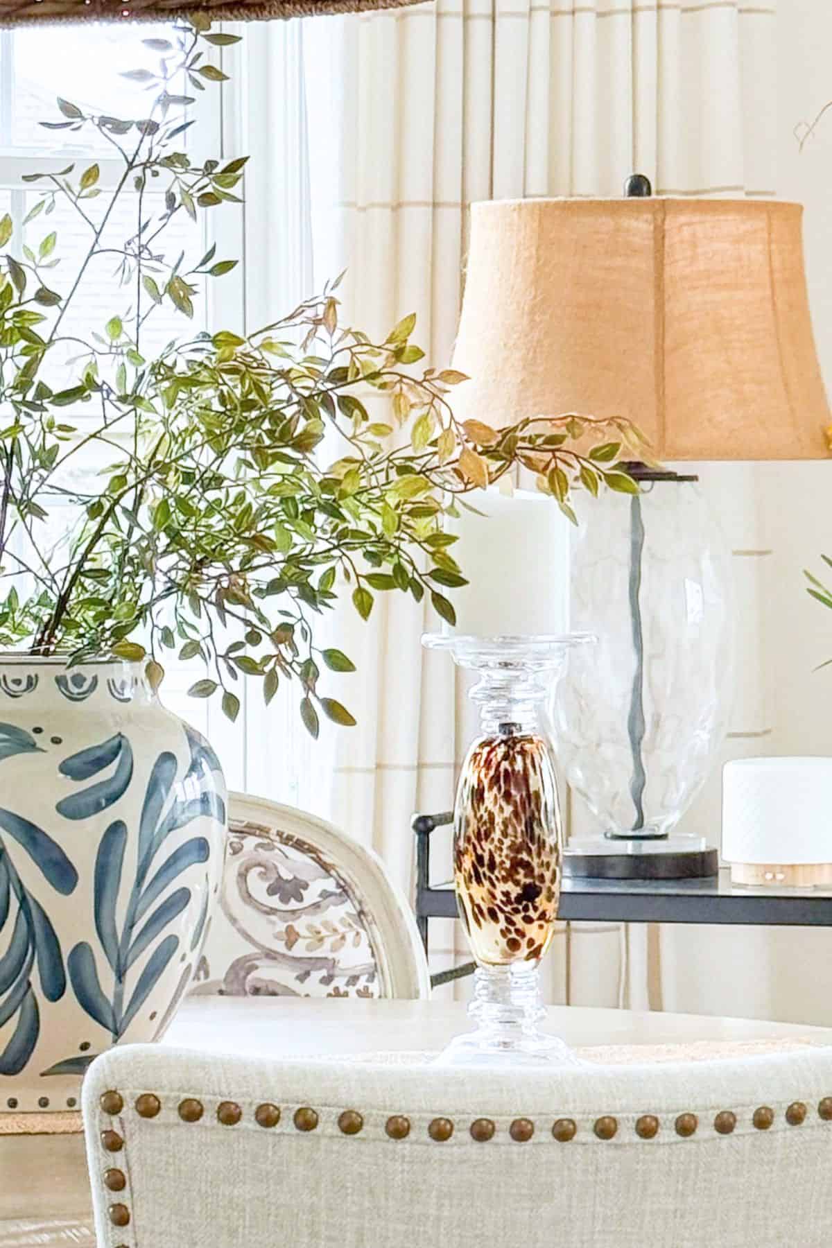
The pillow below is a blend of muddy blue, white, and beige, fusing cool and warm hues together. The blue is a distinctive, muddy, warmer shade of a cool color that works seamlessly in this room. The tension that blue brings adds a bit of life and excitement to an otherwise quiet, beige space.
🌿 TIP BOX: A warmer, muddier blue will always feel more at home with beige than a bright, clean blue. The warmth in the blue is what lets it blend rather than compete.
Beige And Green
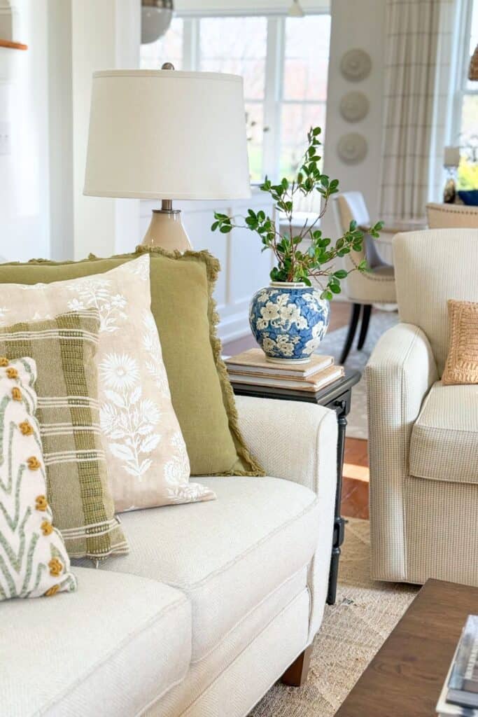
Green is one of the most natural partners for beige, since the two show up together constantly outdoors, think sand and grass, or a linen sofa against a garden view. A soft sage or olive green brings an earthy, grounded feeling to a beige room without adding any visual noise. For something with a bit more presence, a deeper forest green in a single accent piece- a vase, a throw, a stack of books- adds richness while still letting beige lead.
🌿 TIP BOX: Green with a warm, yellow undertone will always blend more easily into a beige room than a cool, blue-leaning green.
Beige And Yellow
A soft, buttery yellow brings gentle warmth and a lift of brightness to a beige room, especially useful in a north-facing space where beige can sometimes read a little flat or gray. Yellow does not need to be bold to work here. Even a pale, creamy yellow in a lamp shade or a stack of pillows is enough to visibly warm up the room.
🌿 TIP BOX: Keep yellow soft and muted rather than bright and saturated if you want it to feel like it belongs with beige rather than competing with it.
Beige And Warm Red, Pink, Or Rust
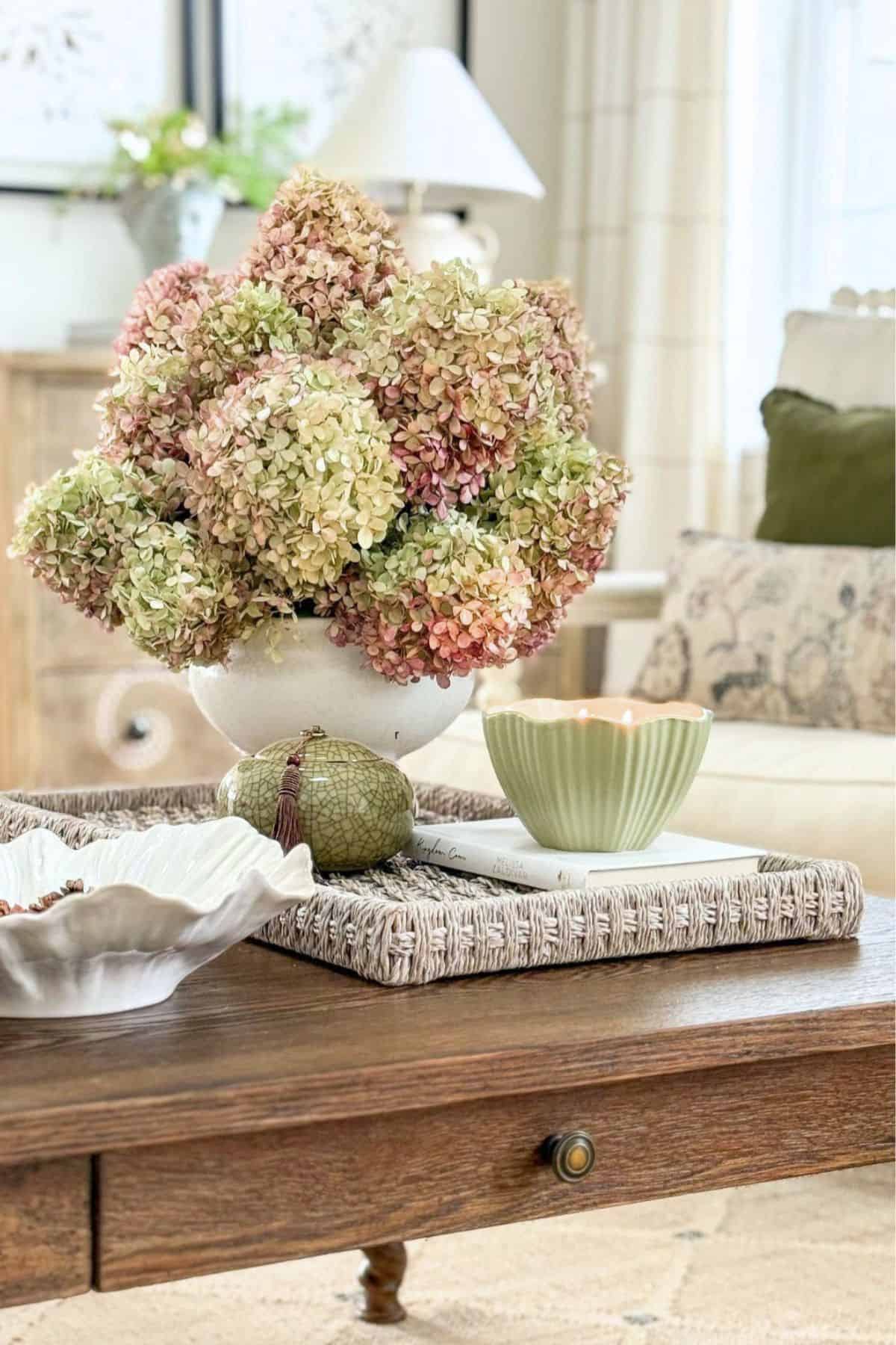
A warm, earthy red or a rust tone adds real depth and a little drama to a beige room, without ever feeling out of place. Think of it the way you might think of a spice, used sparingly, in one or two spots: a throw pillow, a piece of pottery, a stack of vintage books. This is not a color to spread across a whole room. A little goes a long way, and that is exactly what makes it effective.
🌿 TIP BOX: Rust and beige share the same warm family, which is why this pairing feels rich rather than jarring, even though red and beige seem like an unlikely match on paper.
Adding Texture
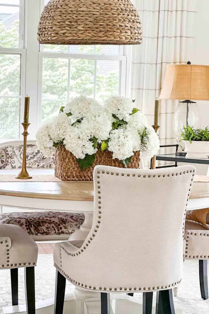
Texture plays an important role in our light and airy home. It grounds the space and keeps it interesting, especially since so much of what we live with here leans toward soft, quiet neutrals. Without texture, a home this light could easily start to feel flat. With texture, that same lightness feels intentional and rich instead.
This matters even more in a home built around beige and other neutrals. Texture is what adds visual interest when color is doing less of the work. Layering different textures brings depth and dimension to a room and keeps it from ever looking one-dimensional or monotonous.
Woven fabrics, a nubby jute rug, tactile ceramics, and natural materials like wood or stone all add richness to a beige room. They bring warmth and make a space feel alive, even when the color palette itself stays quiet.
🌿 TIP BOX: When a beige room feels flat, texture is almost always the missing ingredient, not color. Add one new texture at a time: a woven basket, a linen throw, a wood bowl, and watch how much life it brings before reaching for a new paint color.
The Beauty And Versatility Of Beige
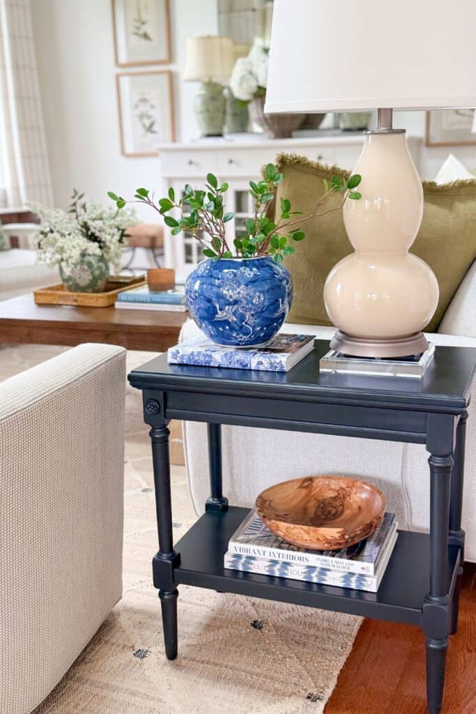
When it comes to timeless elegance and versatility, nothing quite matches the beauty of beige, with its endless array of shades and tones. It brings a sense of calm and sophistication to a room, whether it carries the whole space or simply sets the stage for everything else.
Beige is easy to live with, but do not mistake easy for boring. Its real strength is its adaptability, working just as beautifully with crisp whites and warm woods as with blue, green, or any other color. Few colors offer that same range.
After a decade of cool grays dominating our homes, it makes sense that we are craving this kind of warmth again. Beige gives us that softness without asking us to sacrifice sophistication, and that is exactly why it has never really gone anywhere, even during the years it was overlooked.
Despite its undeserved reputation, beige truly shines as one of the best decorating choices you can make.
Beige Questions You Might Be Asking
Here are a few of the questions I hear most often about decorating with beige, the practical, real-world stuff that comes up once you actually start living with this color.
After years of gray dominating our homes, beige is very much back, and for good reason. It brings warmth and softness that gray never quite offered, while still working as a true, timeless neutral. This is not a passing trend either. Beige has been a mainstay in home design for centuries; it simply got overshadowed for a while.
Beige leans warm, with yellow or brown as its dominant undertone. Greige is beige’s cooler cousin, a blend of gray and beige where the gray undertone comes through more clearly. Both are versatile neutrals, but beige will always read warmer and cozier, while greige leans a bit more toward the crisp, modern feel of gray.
A clean or just slightly warm white goes beautifully with beige. Mix warm neutrals with just a little bit of cool color, like blue or gray, with beige for an interesting contrast and a room that looks interesting.
Beige loves to live beside white and other beiges, in both lighter tones and darker shades. However, it needs a small amount of a cool complementary color to make the room it is in look interesting and alive. Colors like gray or a bit of muddied blue work beautifully as an accent.
A white sofa is a good choice for beige walls, since it will brighten the space. A charcoal gray sofa adds a sophisticated look, a navy sofa brings a timeless classic feel, and an earth tone sofa, like cognac, taupe, or olive green, adds a cozy warmth.
Beige has never needed to shout to be beautiful. It fills a room with warmth, gives every other color a place to shine, and quietly holds a home together in a way few colors can. After years of cool gray taking center stage, it feels good to come back to something this timeless.
Here at Tanglewood House, beige is still that warm, consistent thread running through our rooms, from the walls we once painted to the fabrics and textures we live with now. Understanding undertones, knowing which beiges lean light and which lean deep, and choosing colors that genuinely complement your beige, that is really all it takes to decorate with confidence.
So the next time someone tells you beige is boring, you will know better. Beige is not the absence of color. It is the beginning of good design.
More Ideas You Will Love
Once you have a handle on decorating with beige, these posts are a great next step for building out your whole color story at home.
Blue And White Decorating Ideas That Always Look Fresh And Classic
Blue and white is one of the most timeless combinations in home decorating, and this post shows you how to keep it feeling fresh rather than predictable. It is a lovely companion to the beige-and-blue pairing we discussed earlier in this post.
How To Add A Pop Of Color To A Neutral Room
If your home leans neutral, as ours does, this post walks through exactly how to bring in color without losing the calm, quiet feeling beige creates. A great next read if you loved the contrasting colors section above.
Decorating With Color: 8 Color Lessons Every Home Decorator Should Know
This post takes everything we talked about with undertones and color pairing and expands it into eight broader lessons you can apply to any color in your home, not just beige.
Mastering The Art Of Choosing The Perfect Color Palette
Once you understand beige on its own, this post helps you build it into a cohesive, full-home color palette, much like our own color story has developed over time.
How To Develop Your Decorating Eye: 6 Simple Tips To Get Better At Decorating
A wonderful next step for anyone who enjoyed the more technical parts of this post, like undertones and LRV, and wants to keep sharpening their overall decorating instincts.
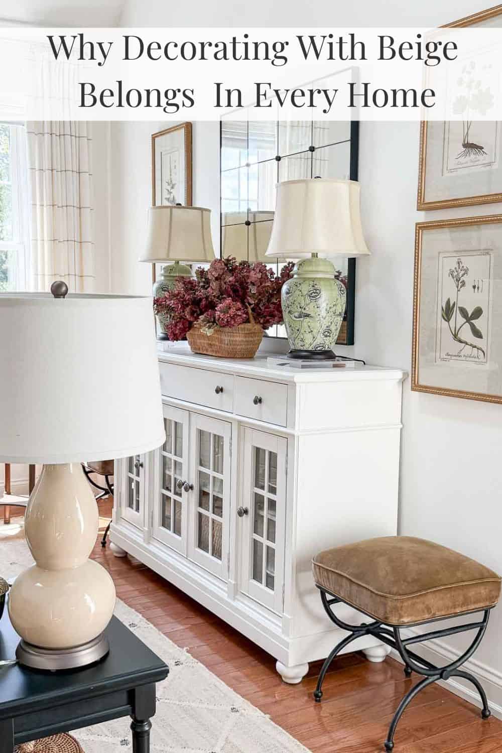
Happy decorating, friends…


Wow – what a great lesson. Thank you!
Yvonne thank you for another great post explaining color theory. It can get overwhelming sometimes without any direction. Pinning!!
Hi Yvonne,
I’ve been reading your blog for a few months now and it’s time I say thank you for all your wonderful decorating tips !! You have helped me more than you can possibly know. I also love that you live in Lancaster county. My dad grew up in Millersville and I have so many wonderful memories visiting my grandparents back in the 60’s and 70’s !! Thanks again!! Gail
This blog was a lot of work and I appreciate it. Lots of information.
This is a fantastic post!!! Thank you
This was so interesting! Thank you!
Great post!!!!!
Thank you so much for this wonderful post. I love beige and the warm neutrals and they certainly have had a bad rap. I have never loved the gray scheme; just too cold.
You explain things so well and your style is fabulous!!
Thank you.
Blessings ~
Sherrie
Thanks, Sherrie! I love beige too.
This article was very informative and gave me good tips on how I can incorporate more beige into my home.
So glad this post helped, Velia
Can you send a link for the pillow on the chair
Here you go:https://rstyle.me/+v7dR36xWYEmuJGX-CX-u_w
Love the pillow , please send a link. Thanks for this post. So much great info
Here you go:https://rstyle.me/+v7dR36xWYEmuJGX-CX-u_w
Where did you get the muddy blue textured pillow? Love your blog!
Here yo go:https://rstyle.me/+v7dR36xWYEmuJGX-CX-u_w
Do you have a link for your pillow? Please and thank you!
Here you go:https://rstyle.me/+v7dR36xWYEmuJGX-CX-u_w
Your blog speaks to me, my home is also mostly beige. I love the blue pillow you have on the chair, where did you get it?
Hi Camille, I found the pillows locally. I can’t find an online source for you.
I would love a coffee table book filled with pages of photos of your beautiful home! I would leisurely flip through those pages all day!
Aren’t you so nice!
Are your burgundy, green, rust colored hydrangeas fresh or artificial? If artificial, where did you purchase them?
The are from our hydrangeas along our front walk. The variety is “ruby slipper”. I dried them and they stayed so nice.
Where did you get your foyer rug & living room rug? Love both of them & they are exactly what I’m looking for.
Hi Pam, see the handwoven juteliving room rug here:https://on.ltk.com/+Fr_airfFyIMJszbRLAgg0A. Here’s a less expensive, washable rug in the same pattern:https://on.ltk.com/+gnbbZMeLZ75vmaThvQKreQ. Our dining room is no longer in stock. Hope this is helpful.
Where are the weeks recipes? the link didn’t work for me!