Decorating With Color: 8 Color Lessons Every Home Decorator Should Know
Decorating with color made simple: learn how to choose a color palette, understand undertones, and use color confidently in your home.
This post may contain affiliate links. See our Discloser Policy for more information.
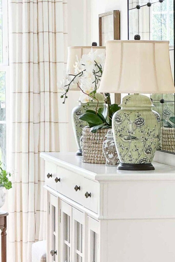
Decorating with color can feel confusing at first, but a few simple color lessons can make it much easier to use color confidently in your home.
Today, let’s chat about color. You might think I would be the last blogger to give color advice that could change the way you decorate your home. After all, my home is very neutral. And yes, it is. But although it leans neutral, there is actually more color in our home than you might think.
I work with color all day long. As a decorator and shelter blogger, my world is filled with beautiful rooms, beautiful textiles, and beautiful colors.
Color can feel complicated when you first start decorating. But one of the things I love most is breaking decorating concepts down into simple, doable ideas you can use in your own home.
Here are eight color lessons that will help you use color with more confidence when decorating your home.
Know Your Color Palette
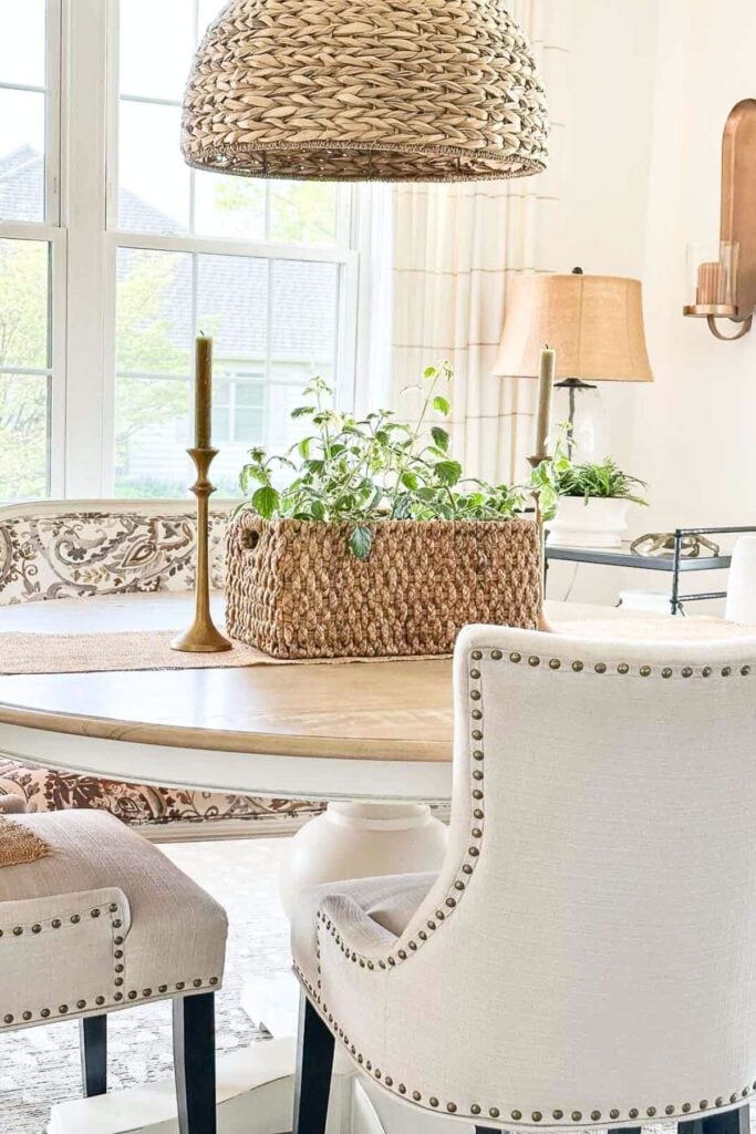
A color palette is a beautiful thing when it comes to decorating. Choosing colors for a room, or for your whole home, and sticking to them is so important. This is the first color lesson every home decorator should know.
Here are a couple of ways to make decorating more complicated than it needs to be:
- Working with too many colors: It’s easy to get carried away, but it can create a visually chaotic space unless you are a seasoned decorator.
- Using only a few colors: While simplicity is key, too few colors can look bland and uninspired. This is a mistake I used to make.
- Constantly switching colors: Indecisiveness can turn into a never-ending cycle of paint swatches and mood boards.
- Not knowing your colors: Without a clear understanding of your palette, your rooms can feel disjointed.
Stay In Your Lane
Make a color palette decision and stick to it.
Opt for 3 to 5 complementary colors that work well together, and don’t forget to add white and black for balance. Use lighter and darker versions of your primary colors to add depth.
If you want a strong foundation for decorating your home, you might also enjoy reading 12 Decorating Rules You Should Almost Never Break.
Using Colors You Are Stuck With
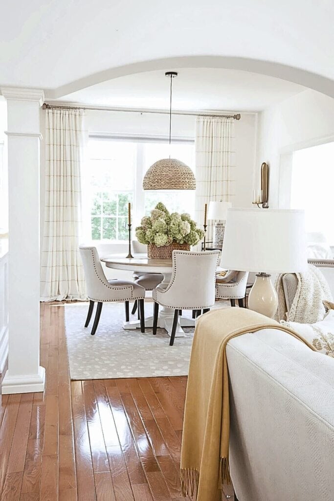
Ever stare at a red or rust brick fireplace that you just can’t paint over? Or maybe you have golden oak floors you would love to replace? Most homes have elements we are stuck with and are not exactly thrilled about.
If you find yourself stuck with something like a purple sofa, don’t fret. With small accents, you can incorporate hints of that color into your decor. Think pillows, throws, or vases in similar shades. Keeping these additions small ensures that when the time comes to replace the sofa, you can easily remove those accents too.
The flooring in our home is oak, but not a very pretty oak. Its orange undertone can be troublesome, and we are not planning to change it. Instead, I kept our color palette warm and added pops of caramel with cinnamon undertones. This helps the flooring feel more intentional and makes our rooms feel cohesive and inviting.
Embrace the color you are stuck with by using it as an accent. Just a couple of items in a similar shade placed around the room can help tie everything together. Do not let imperfect things in your home steal the joy of loving the home you have.
Many color issues come from simple decorating mistakes that are easy to fix. You can find more helpful ideas in 60 Simple Decorating Tips That Will Make A Big Difference In Your Home.
Working With Bossy Undertones
Every home has something with a bossy undertone, like flooring, brick, or a less-than-perfect sofa color, that demands attention. Instead of fighting it, pull that undertone into your color palette. Repeat the color in small accents, pillows, or accessories so it looks intentional. When you work with a bossy undertone instead of against it, the whole room feels more harmonious and you will be happier.
Color Is All About Undertones
Color complexity often comes from undertones. Undertones are the hidden tones beneath a color that affect how it looks and how it interacts with other colors.
Learning to recognize undertones is one of the most helpful things a decorator can do. They give depth and character to a color and play a big role in whether colors look harmonious together or slightly “off.”
When the undertones of the colors in a room work together, everything feels cohesive and comfortable. When they clash, even beautiful colors can look a little awkward next to each other.
Becoming familiar with undertones will help you make much better decorating decisions. Once you begin noticing them, you will start to see them everywhere, in paint colors, fabrics, flooring, wood tones, and furniture finishes.
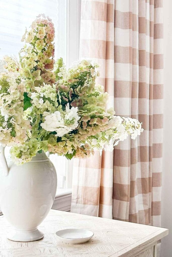
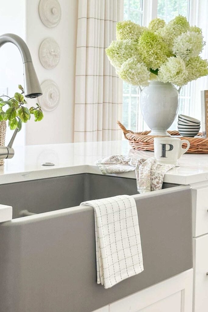
The hydrangeas in this arrangement are a perfect example of how undertones work in decorating. At first glance, they look like soft, neutral blooms. But when you look a little closer, you can see subtle hints of green, blush, and even a whisper of peach.
Those gentle undertones are what make them so beautiful and easy to decorate with. They quietly connect to the warm tones in the checked curtains and the creamy white of the vase, helping everything feel pulled together without looking matchy.
When you start noticing undertones like this, decorating becomes so much easier. Instead of guessing, you begin choosing pieces that naturally belong together.
Understanding Clean And Dirty Colors
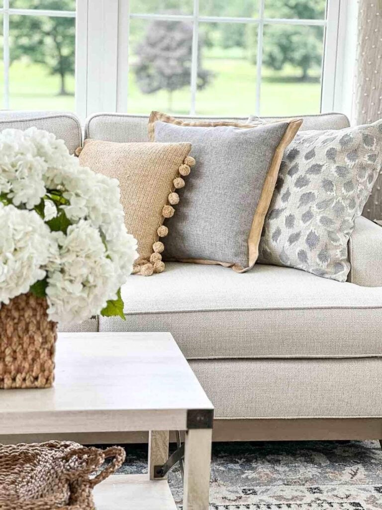
Learning about the concept of clean and dirty colors felt like a revelation to me. It’s a fundamental aspect that every home decorator should grasp.
Why is understanding clean and dirty colors so important? Because we all want a beautiful home! Knowing the difference between the two makes decorating so much easier. Clean colors work best with other clean colors, and dirty colors look best with their counterparts. Mixing them in the wrong way or in the wrong amounts can make a room feel unbalanced and a bit dull. If you ever wonder why the colors in a room look a little off, it is almost always the undertones competing with one another.
In the image above, clean and dirty colors live happily side by side, creating a cohesive look. They can look beautiful together, giving a room depth and interest. It’s all about getting the undertones right.
Here’s a huge post with everything you need to know about Clean Colors, Dirty Colors, and Undertones. Knowing about undertones will make decorating with color more sensible.
Using White
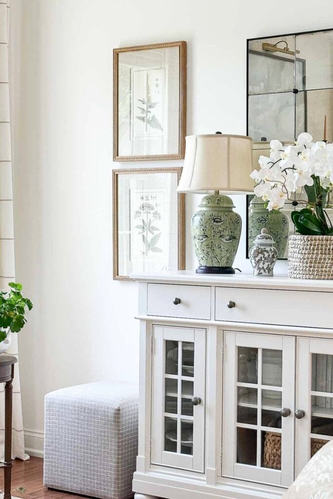
White has the magic ability to make everything in a room look fresh and clean. It also gives the eye a place to rest, which keeps a color palette from feeling too heavy or overwhelming. My best advice is to use plenty of pretty white when you decorate.
I use quite a bit of white in our Tanglewood home. Our house is very open, with high ceilings, interesting architectural details, and lots of windows that look out onto the ever-changing views of our country golf course. Before we bought it, all the walls were painted a medium tan color, which made the rooms feel closed in and disconnected from the beautiful scenery outside. I knew painting the walls and trim white would make the whole house feel cohesive and open while letting the view become the focal point in every room.
We chose to paint our entire home Simply White by Benjamin Moore. It is a creamy white that reads bright yet warm.
Here are a few tried and true tips for decorating with white:
- Use white as a backdrop: Walls, trim, or large furniture pieces in white create a calm background that allows other colors in the room to shine.
- • Add white accessories: A white vase, lamp, or bowl can brighten a vignette and make the other colors in your palette stand out.
- • Layer different whites: Mix warm whites and cool whites carefully, but do not be afraid to use variations. This adds depth and keeps a room from looking flat.
- • Pair white with texture: Woven baskets, nubby throws, linen pillows, and rustic woods look especially pretty against white because the texture stands out.
- • Break up bold color: If you love using strong colors, balance them with plenty of white so the room feels cheerful rather than overwhelming.
- • Bring white into every room: A bit of white in each space helps tie your whole home together, even if the rooms have different color palettes.
White truly is a decorator’s best friend. It works with every style and season, making decorating easier because it plays so well with everything else.
Not all whites are the same! Some have warm undertones (yellow, peach, or red) and others lean cool (blue, green, or gray). When decorating, try to stick with whites that share the same undertone family, so your space feels cohesive. If you love the look of mixed whites, make sure the undertones don’t clash—this small detail makes a big difference.
Don’t Use A Color In Isolation
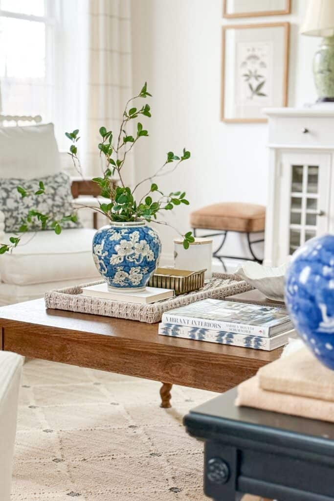
Color works best when it is repeated around a room. When a color appears only once, it can feel random and out of place.
A simple decorating rule to remember is that color should flow through a room naturally. When the same color appears in more than one place, the eye travels comfortably from one spot to another.
For example, if you use blue in a pillow on a sofa, repeat that blue somewhere else in the room. It could appear in a piece of art, a throw blanket, a vase, or even a book on a coffee table. Repeating color helps everything feel connected and intentional.
This is exactly what I did in our living room at Tanglewood. I have two green lamps on the sofa table behind the couch. Instead of letting that color stand alone, I repeated the green in a few other small places around the room. There is green in a piece of artwork, in a couple of decorative accessories, and in the stems of flowers on the coffee table. Because the color appears several times, the lamps feel like they belong in the room instead of looking random.
This does not mean you need a lot of the same color. Even small accents can make a big difference. A few carefully placed items in the same shade will help a room feel balanced and thoughtfully decorated.
Many people choose wall paint or big-ticket items like sofas or rugs without thinking about how they will work with the other colors in the room. Before making a decision, bring home large paint samples and fabric swatches and see how they look with the colors you already have.
Pop Of Color
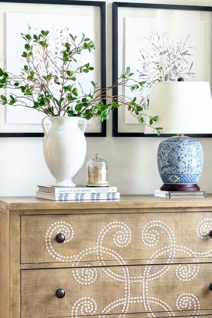
Adding a pop of color is an easy way to wake up a room. Even a mostly neutral space can feel more interesting when a small bit of color is tucked into the decor.
Tips For Using A Pop Of Color
- Repeat the color at least three times: A color looks intentional when it’s sprinkled throughout the space, not just in one spot
- Vary the size of the accents: Use a mix of large, medium, and small touches of the color for a natural look
- Balance the color around the room: Place accents on different sides of the room to keep the eye moving and create balance
- Use different textures and finishes: A pillow, a lamp base, and a piece of pottery in the same color will add depth and interest
- Anchor the pop of color with neutrals: Pairing bold colors with white, beige, or gray helps them look fresh instead of overwhelming
- Change pops of color seasonally: Swap in lighter or brighter tones for spring and summer and richer, deeper ones for fall and winter
- Keep it simple: Too many bold colors can compete. Focus on one pop color at a time for the most balanced, cohesive look
You can read more about this in Why Balance Is Important.
Light And Color
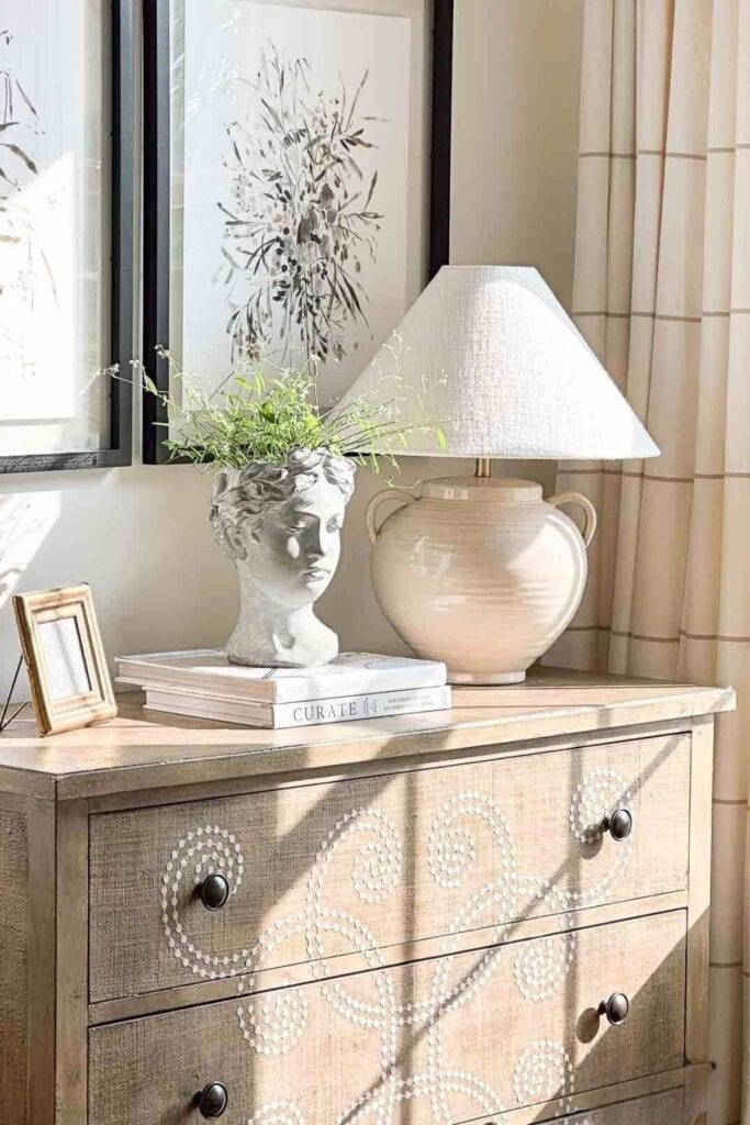
Light plays a huge role in how color looks in a room. A paint color, fabric, or rug will change depending on the time of day and the kind of light it’s seen in. Morning light can make a color look fresh and cool, while evening light often makes the same color feel warmer and softer. Artificial light also changes how colors read, depending on the type of bulb you use.
That’s why it’s so important to test colors in your own home before making a decision. The easiest way to do this is to paint large pieces of white poster board with your sample colors and tape them to different walls in the room. Look at them at different times of the day, and with the lights on and off, before choosing your final color.
Tips For Working With Light And Color
- Test colors in natural light: Open the blinds or curtains and check how your paint or fabric looks in the morning, afternoon, and evening.
- Check with artificial light: Incandescent, LED, and warm bulbs all affect color differently. Use the kind of light you plan to live with.
- Think about direction: Rooms facing north usually have cooler light, while south-facing rooms get warmer light throughout the day.
- Don’t skip the night test: A color you love during the day can feel completely different under lamps at night.
- Sample generously: Small paint chips won’t tell you enough. Go big with poster board or paint large swatches directly on your wall.
Light and color are inseparable. Once you see how much light affects your choices, you’ll be able to pick colors that look beautiful in your home all the time, not just in the paint store.
Pro Tip: The Lightbulb Test
The type of lightbulbs you use will change how color looks in your home. Warm bulbs bring out yellow and red undertones, making colors look cozier. Cool bulbs highlight blue or gray undertones and can make a room feel fresher. Daylight bulbs give the truest read of color but can sometimes feel harsh. Before committing to a wall color or fabric, check it under the same lightbulbs you plan to use in the room.
Know The 60-30-10
This decorating principle is as classic as they come, and for good reason. It works. It is also very easy to understand and use. The 70-20-10 rule is just a variation of the same idea.
In the 60-30-10 breakdown, 60% of a room’s color scheme should come from one dominant color. This usually includes the walls, flooring, and larger furniture pieces. A seasoned decorator knows that sixty percent is often best when it is a neutral because neutrals create a calm backdrop and allow the other colors in the room to shine.
Colors like white, beige, gray, sand, taupe, caramel, and buff all work beautifully as dominant neutrals. I personally lean toward lighter and war,er, neutrals, but the key is to choose a neutral you love living with. You can read more in What You Need To Know About The Color Beige. It is a very helpful post.
The 30 percent is your secondary color, where depth and personality begin to build. Think about a chair, drapes, a large rug, or a painted piece of furniture in a contrasting but complementary color.
Finally, the 10 percent is your accent color, what some decorators call the pop. This color should be repeated in smaller ways around the room, in pillows, art, flowers, books, or decorative accessories. It may be the smallest part of the room, but it can make a big difference.
The 70-20-10 rule works the same way, with a slightly stronger focus on your main color. It is often a better fit if you love a more neutral, simplified look and want your secondary and accent colors to feel softer.
Tips For Using The 60-30-10 (Or 70-20-10) Rule:
The 60-30-10 rule is a simple way to keep color balanced in a room. These tips will help you use it in a way that feels natural and easy.
- Use it as a guide, not a hard rule: It should help you make decisions, not box you in
- Think about where the percentages go: Walls and larger furniture usually carry the dominant color, textiles and upholstery often make up the secondary color, and smaller accents round out the rest
- Aim for balance, not perfection: If the room feels calm and cohesive, you are probably using the rule well
- Pay attention to undertones: No matter the percentages, colors need to work together underneath or the room will not feel cohesive
This simple rule makes decorating with color feel much less overwhelming and helps a room look pulled together and intentional.
Decorating with color does not have to feel confusing or complicated. When you understand a few basic color lessons, using color in your home becomes much easier and much more enjoyable.
Start with a simple color palette, pay attention to undertones, and remember that light affects how colors look in every room. Repeating a color throughout a space, adding a small pop of color, and using simple guidelines like the 60-30-10 rule can help you create rooms that feel balanced and cohesive.
The more you work with color in your home, the more confident you will become. Over time, you will begin to trust your eye and enjoy the process of decorating with color. Decorating with color should feel creative and fun, not stressful. These simple lessons will help you use color with confidence in every room of your home.
More Helpful Color Decorating Tips
If you’d like even more helpful ideas about using color in your home, here are a few related posts you might enjoy:
Mastering The Art Of Choosing The Perfect Paint Color
Learn how your decorating style and color palette work hand in hand. This post will help you choose colors that highlight your personal style and keep your home feeling cohesive.
7 Tips For Decorating With Neutrals
Neutrals don’t have to be boring! This post shares practical tips for using neutral tones in a way that feels fresh, layered, and full of interest.
How To Make The Move To A More Neutral Color Palette
Thinking about shifting to a more neutral home? This post walks you through the steps to create a soft, timeless palette that’s easy to decorate with.
Frequently Asked Questions About Decorating With Color
Choosing and using color can feel tricky at first, but once you understand a few basic ideas, it becomes much easier. Here are some of the most common questions I get about decorating with color.
A simple rule of thumb is the 60-30-10 rule: sixty percent dominant color, thirty percent secondary color, and ten percent accent. For a softer look, I also like the 70-20-10 guideline. Both formulas keep your rooms balanced, intentional, and easy to decorate.
1. Start with how you want the room to feel. Do you want your room to feel calm, cozy, cheerful, or restful? 2. Then think about the light in the space and the finishes that aren’t changing, like flooring or cabinetry. 3. Choose 3–5 colors that work well together, including at least one neutral, one supporting color, and one accent. Repeat those colors throughout your home for flow and consistency.
Choose one consistent neutral, like white, beige, or gray, to carry throughout your home. Then let each room introduce its own accent color. This keeps your whole house feeling cohesive, while giving each room its own personality.
Most homes have something you are working around, whether it is flooring, cabinets, or a large piece of furniture. Instead of fighting it, use it. I know it sounds counterintuitive, but this tip works. Pull a color from that element and repeat it in small ways around the room so it feels intentional and connected.
Understanding color is all about understanding undertones. Undertones are the subtle colors underneath a main color. They affect how colors work together. When undertones clash, a room can feel a little off, even if the colors are beautiful on their own. When they work together, everything feels more cohesive.
Shopping Guide
Happy decorating, friends…


Hello Yvonne – could you tell me where you purchase the beautiful planter on your dining table? Thank you
Hi Betsy, I found it locally. Sorry I don’t have a source for it.
Thank you so much for this informative post. I cannot tell you how many mistakes I’ve made (but my husband can) when selecting paint colors. Now for the first most asked question…where did you get that gorgeous floor lamp beside the chair? Thank you, Yvonne!!!
I’ve had the floor lamp for ages. I found it on Wayfair, but I don’t see it now. Sorry! Look there for something similar.
First- you are better, I hope and pray? Wishing you good health from upstate CNY.
Then thank you, your post today could not have reached me at a better time, or moment, actually.
Just came home from a shopping trip, looking for inspiration…found none. I was empty inside and sad. I am single, older, live alone with my pets. It is below freezing here and dark early in the mornings and at night.
I have so many color loves and have been constantly re-doing my 1515 sq ft home, built in 1880 with some weird re-does over the decades, lol home for ten years now, with no satisfaction. Always thinking “next time, I’ll get it right”. And I have huge bags of fabrics, bedding, etc to show for it, all taking up way too much space in my house and in my mind. Now I have a real plan! Thank you again.
Your post took me to others online along a similar theme and now I am so sparked, feeling creative and “sure” about where I am headed not only in my home, but in my life!!!
Funny how we find just what we need at the right moment, you saved me today!
I’m so happy to help! Happy New Year!
I have a burnt orange sofa in my family room that I
Absolutely hate. We lived by a lake before and the color went
Well with those surroundings. I have changed the pillows
But still feel like it’s sticks out like a sore thumb. Any suggestions for me?
A sofa is like an elephant in the room… hard to hide! Bite the bullet and replace it. You will be so much happier! Sorry I don’t really have a fix that you would be happy with.
Very helpful….thank you!
I’m in the middle of a renovation. I had the bedrooms, office, both baths, and laundry painted in a soft cream colour. Just enough contrast between the walls and casings. The color is perfect in the bedrooms and office, But in the ensuite with marble walls, it casts a golden tone on such. I’ve now picked a very light griege for that room. I thought white would be too sterile with white trim, white vanity, white quartz countertop and white & grey marble. I hope looking from the bath to bedroom or vice versa that the griege will look good with the cream. Paint is not easy for the layman!
Thank you for another great lesson. I love how you pick apart a design issue into bite size pieces so we can learn from it.
Yes, paint is complex. When working with greige it is all about the undertones!
I picked Wish by BM. I have read that in a southern light some see a red undertone but I’ve read others were they say the undertones are yellow & gray and really shows no undertone just a soft, light griege. ?♀️ It’s not a south facing room so I believe it will look good with the grey & white marble. ??
Yvonne, I have returned 4 rugs trying to find the right neutral rug for my livingroom. I just love your rug and think it might work, so would you mind telling me where you found it?
You will love this rug. It’s so well made and thin for a sisal rug which is a big bonus:https://rstyle.me/+DF9OcYN_rlfzShtOr5HJgw
With the 60-30-10 rule I have a warm walnut as my 60, black as my 30 and green is suppose to be my 10 that has now turned into 30+. I have a tons of green leafed house plants that I love and don’t want to get rid of. Is there another way to make this rule work around outdoor-indoor styled home?
Use the same principles, Bonnie. They work indoors and out. However, I would not count green outside. There is just too much of it!
Yvonne, was this rug available in multiple colors? Your rug does not appear to have an “orange” undertone like the one on the website you referenced?
How do you get large items returned?
We need this secret! Is it in your purchase agreement? What is the charge for return?
Details, please.
I ALWAYS keep the packing! If I don’t like something I pack it in the original packing, print the label and send it back. I read all the return requirements of everything I buy!
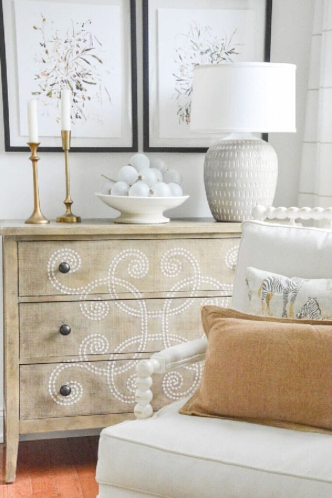
Love all this info re: color, especially white. I love the lumbar pillow in the first picture. I am redecorating using ivory and a camel beige. That pillow would work beautifully. Any info on where/how to purchase?
Hi Sheryl, I got this pillow years and years ago from Ballard Designs. Here is their more current version;https://rstyle.me/+fIck1x64IucOdy1Qoz-vng
This is a great post. Very helpful as I am trying to decide if I want to keep my Sherwin Williams “Believeable Buff” walls or change to white.
Thanks!
I’m so glad this post was helpful. Believable Buff has very strong yellow undertones.
I was thinking maybe with some eyesore things, you may be able to hide them. I have a random cord coming out from the wall I don’t know how to remove that I think the prior homeowners had for something related old school internet hookup. I hid the whole thing behind a furniture piece. I used to have a loveseat in an apartment, and it had a frumpy pattern and a streak from something that would not come off one arm. I bought a white slipcover cheaply and used that and cute pillows and a white throw until I later replaced it with a nicer couch. Now I am in a house and there are options in a house you do not have when you are in an apartment. Some things you can’t DIY or hide or replace, I know, in an apartment OR a house depending on circumstances. . Sometimes it is not in the budget in any home you are in, and maybe you can change it later on. I think maybe a big focal point like a painting, for example, maybe it has burnt orange within it, which maybe isn’t your favorite color and the same orange is your fireplace brick tone, but if burnt orange is not the MAIN color in the picture, it ties in the brick without making the orange so dominant you hate the artwork and the brick fireplace. It is hard to live with something very unattractive. I think I have focused on keeping the home neat as I can, then I feel better about whatever the thing is I am stuck with.
Great tips and advice. Plus your lovely home shows how it all works! I agree with your comment regarding being happy with what you surround yourself with. It makes all the difference in the world.
Have always just used color in my decorating but after reading your article replaced somethings with white items. Much to my delight they made my favorite colors pop more! Am now working room to room adding white and beige to make every room special. Thank you for opening my eyes to the use of white/beige.
Where can I purchase the white vases with wire hangers and open drops on your side board?
Thanks! Keep the post coming.
Hi Nan, they are really pottery lanterns. I like to use them as vases. They came from Pottery Barn years ago. I have not seen the lanterns on their site recently.
I just put our guest bedroom together for a family visit. The decisions to what colors to add was so hard. I love whites but needed to add in some color from the rug we placed under the bed that had whites with navy/ light blues. So of course I added some blue in the pillows, sheets and chair throw but yet I needed one more color for the bed throw and table flowers…go more blues? add another color? ( I had wood, wicker baskets and tall wood armoire)…so I added burnt orange on the end of the bed and roses in the vase. It works! I always love all white with texture but many times I need a tad bit of a pop of color. Great color tips.
A few things that I have learned about decorating with five houses in two areas of the country, NJ and now Aiken, SC. Instead of buying numerous cans of paint to test color – get Samplize.com samples. They are very inexpensive and are painted with the actual SW or BM paint, have sticky backs that won’t harm walls so they can be moved from wall to wall. I think that most “DIY decorators ten to be too “matchy, matchy” to be safe. I would recommend hiring a professional decorator, even for just a consultation. (No I am not a professional decorator). Another set of eyes can bring a whole new and different prospective and the fee can offset money spent on mistakes. I used a great decorator for my current home and it always gets a “WOW” when people walk in.
Hi Carole, what great tips! I think hiring a decorator is a great idea.
Love your posts, so inspirational to me!
Can you please share where you purchased the white chair with the spindle detail ( has two pillows on it).
Thank you ?
Hi Cathy, I’ve had that chair for over a decade. You can see a similar chair here:https://rstyle.me/+PbH9DvQvU56_2EVhNsm7pQ
Thank you for all of your inspiration. Because of you I’m learning how to be a better decorator. Loved reading this.
Yvonne, I always enjoy reading all your posts. This one on color is really helpful. I really liked your suggestion about picking out a color and then painting a sample on a few walls to see exactly as it would look at several times during the day. This was so helpful when we painted our Living Room. I always appreciate you sharing with us. You always have such wonderful suggestions. I know that our home is so much better because of you and your posts. You spend so much time on your posts and I thank you for the knowledge I have acquired because of you, Yvonne! Bless you!
I love the rug in your beautiful sunroom! May I ask where you got it? I think it might be just what I’m looking for! Thanks Yvonne for any help you can give me.
This rug is very popular, Debbie. However, it is out of stock and I can’t find another source for it. So sorry.
Such great info and inspiration! Thanks so much!
You are welcome, Kristin!
I love your style and I have learned so much from your blogs and pictures. I am in the process of deciding on a fan for my family room. My room is similar in colors to yours and I am wondering what color fan to get. I have been looking closely at yours but I cannot tell what color you have chosen. I am afraid to go too dark as I feel like it will be the first thing you see upon entering. Would you mind telling me what finish/colors you have used in your room? Thank you so much!
Our fan is a light brushed silver. It came with our home. You are right to pick something that does not call attention to itself.
I have honey colored kitchen cabinets. I really don’t like them but if stuck with them, what color do you recommend painting the walls?
Thank you.
Paint your walls white. A warm white would look best. Keep it crisp and clean.
Hi there, any thoughts on style of home and cohesiveness on interior?
I see brick ranches with shiplap….while I prefer coastal farm cottage (IKR????) but can that be incorporated in any home?
Thx! (Marsha from KY)
Wow, that is a question with lots of opinions. Here’s my two cents: I believe that the architectural style of our homes should dictate, to some degree, the inside style. A home has trouble looking cohesive if the outside and inside don’t work together, or look cohesive. A rancher is sort of a chameleon. It can be decorated in several ways depending on the architectural elements. A brick rancher would look great with Traditional, Transitional or Mid-Century Modern. It hurts my heart to see a home when the inside of the home diverts drastically from the outside architecture. Again, just my opinion. However, bottom: do what you love if you are happy living with it. Hope this helps.
Yvonne, I have stopped receiving your Sunday blog? Can you help me why I don’t receive? I love the Sunday blog. Thanks
Nancy, I answered your question when you commented before. Are you getting any emails? I hope you get this. Check your spam folder. For some reason (who knows) newsletters can find their way there. If you find it, put it back into your inbox. If it’s not there, wait until this Sunday and if you do not get it email me: [email protected]. I see you are still an active account on my email server, so I don’t want to inscribe you because you would have to resubscribe. I cannot do that. Go to stonegableblog.com to see all my posts. Thanks for letting me know.