Spring In The Living Room: A Mini Spring Tour 2025
Join us for a spring living room tour. Get ideas and inspiration for decorating a living room for spring.
It’s been quite the bustling spring season for us! I must admit, I’ve fallen a bit behind in capturing fresh images for a spring tour. But, this morning the light was absolutely perfect, allowing me to snap over 400 photos! After a bit of editing, I’m thrilled to share a glimpse into our spring-infused living room.
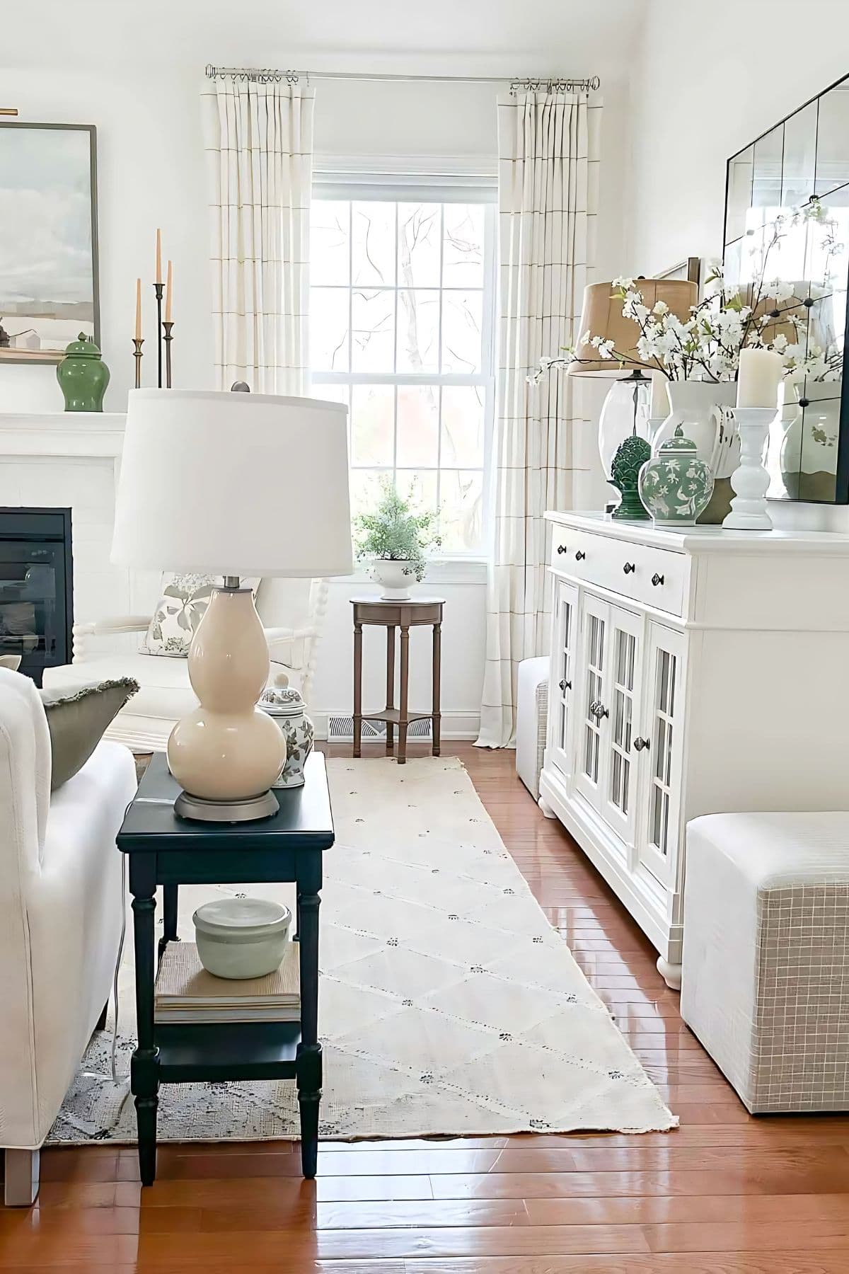
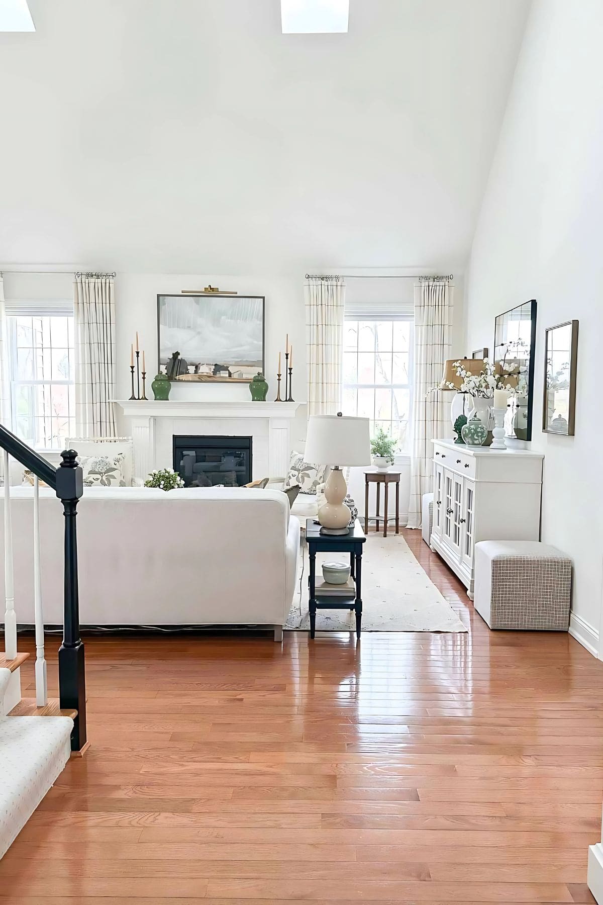
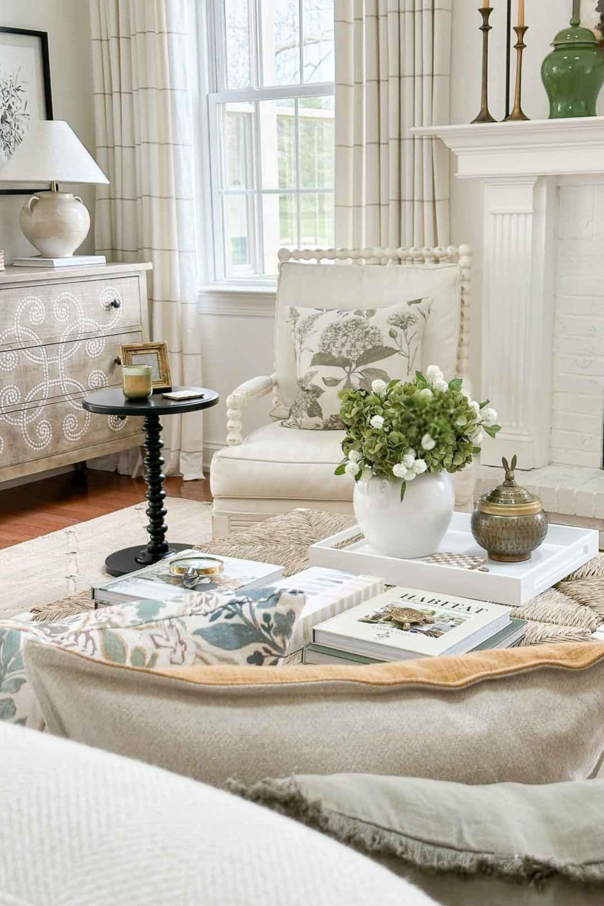
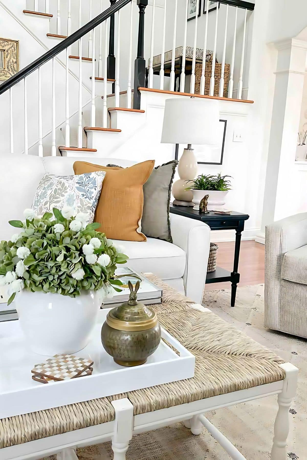
Recently, I’ve introduced just a few subtle updates to this space. For a fuller look, I’ve opted to hang curtains on both sides of our windows rather than just the outside. The center of the room now features two rush seat benches, repurposed as a coffee table. And, of course, some new pillows and seasonal decorations.
The standout change in our living room this spring is the introduction of the color green. There’s something about green that just works seamlessly with our neutral palette, especially with the views of the golf course right outside our windows. Green is also trending as a top color for 2025. I sensed its rising popularity back in 2024 and felt it was time to bring this vibrant hue into our home.
A Pop of Green
Green may always be a classic, but its recent surge as a trend has some great advantages. The market is now brimming with a variety of green home decor items, making it a joy to explore new decor. Plus, with many influencers incorporating green into their homes, there are lots of beautiful examples out there showing how to use green in our homes. Even better, because green is timeless, it remains stylish even when it’s not the hottest trend. With all that said, I absolutely LOVE green and am thrilled to incorporate it into our home this spring.
Adding a New Color to Your Home
Introducing a new color to a neutral palette might seem straightforward, but it’s not. Regardless of your room’s established palette, there are a few key aspects to remember to make sure a new color looks seamless and feels right.
One important element to consider is undertones. Undertones are subtle colors that reside beneath the surface of a color, and they can make or break the overall aesthetic of a space. Understanding and matching undertones can greatly enhance the beauty of your decor. For a deeper dive into this topic, you may want to check out my posts on Can You Mix Warm And Cool Colors In Decor and 8 Things To Know About Color.
Another important factor is the proportion of the new color you plan to introduce. Aiming to add 10 percent or less of a new color to your room is a good guideline. Strategically placing items of this color throughout the room can help achieve a balanced look.
The old adage that “all greens go together” is true, but some greens pair better than others. Our living room is filled with warm neutrals, so I chose greens that are more muted and warmer to complement these tones.
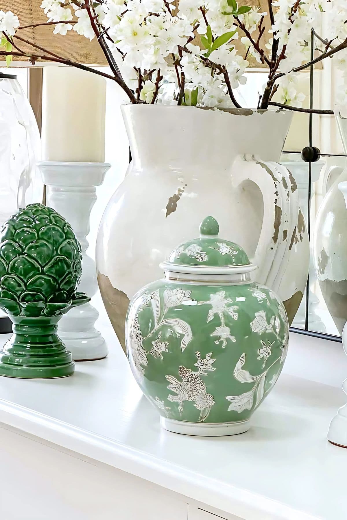
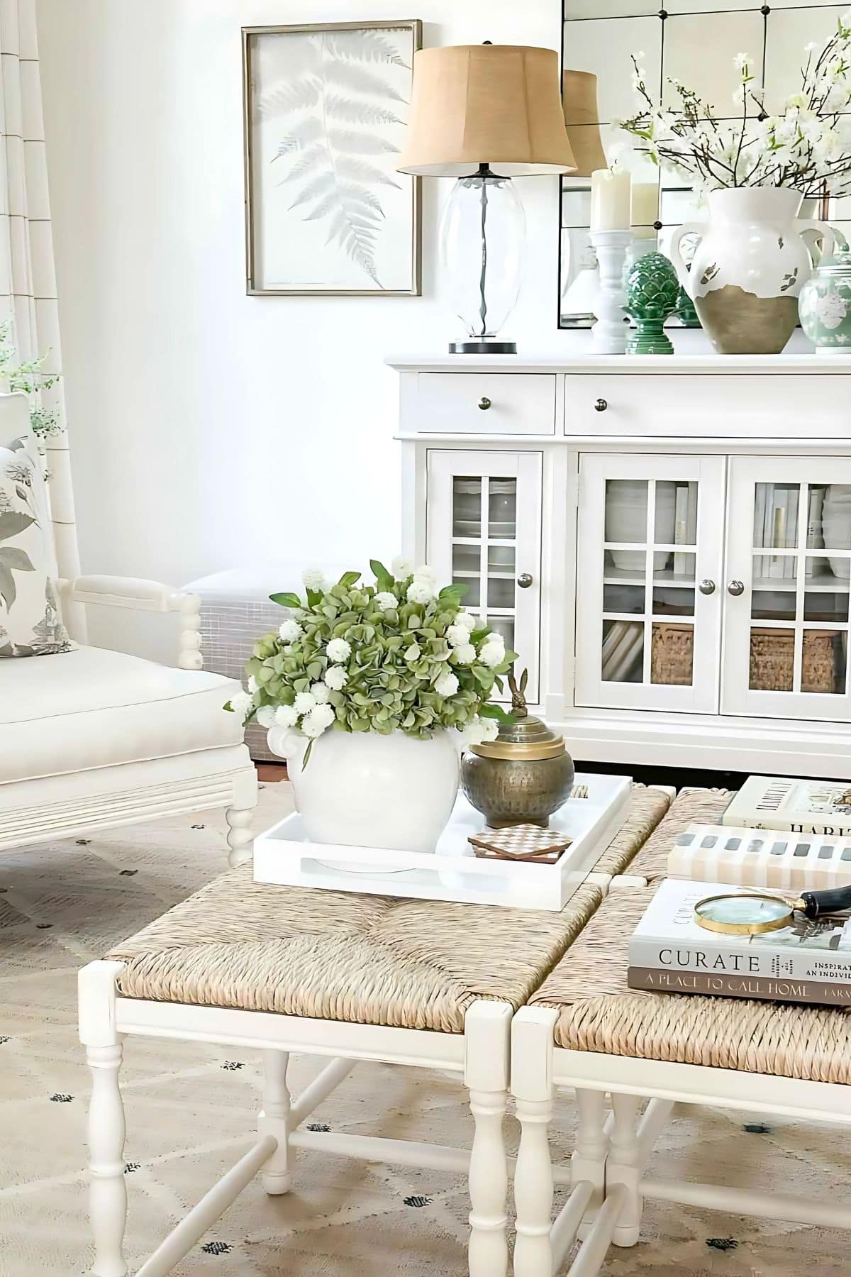
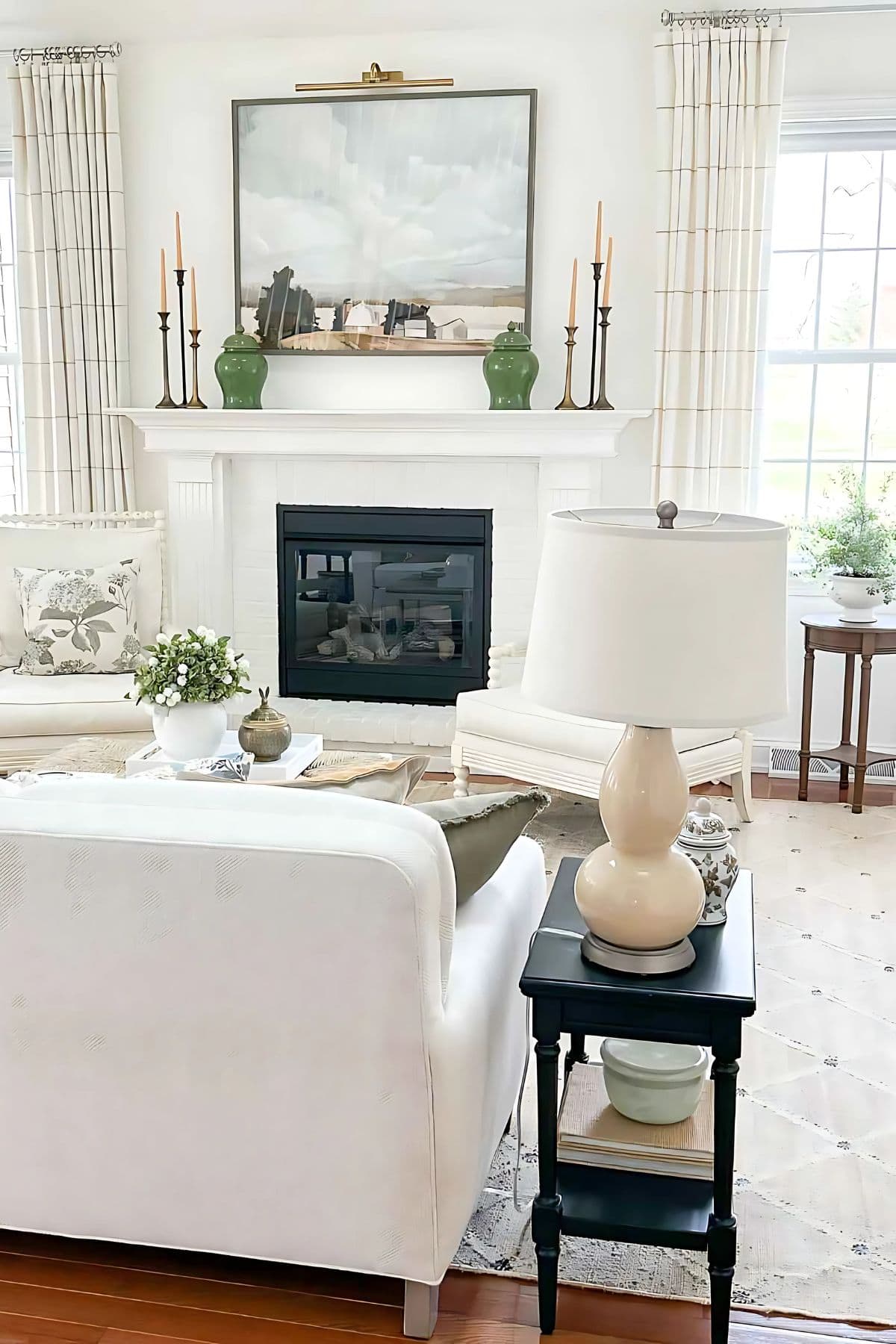
One standout piece is the bright medium green artichoke finial on the white buffet. An occasional outlier, like the artichoke, can add a layer of visual interest and create what we perceive as an engaging tension in the room. To be honest, when I stumbled upon this charming accent piece on Amazon, I was determined to incorporate it regardless of its shade. It now sits alongside a green and white chinoiserie jar, which usually lives our bookcase, creating an interesting contrast.
Using a Light Hand to Decorate for Spring
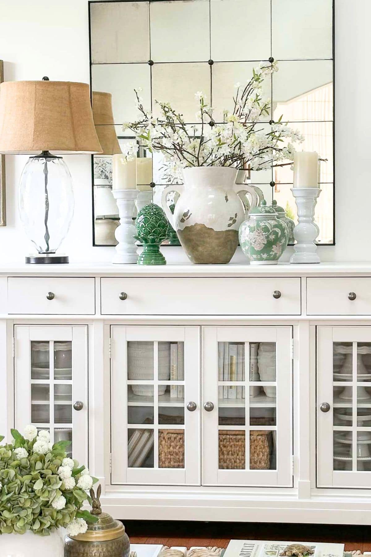
This spring, I decorated very lightly for the season at hand. When you step into our living room, you’re welcomed by cherry blossom branches in a large urn on the white buffet. This arrangement is such a statement piece in the living room.
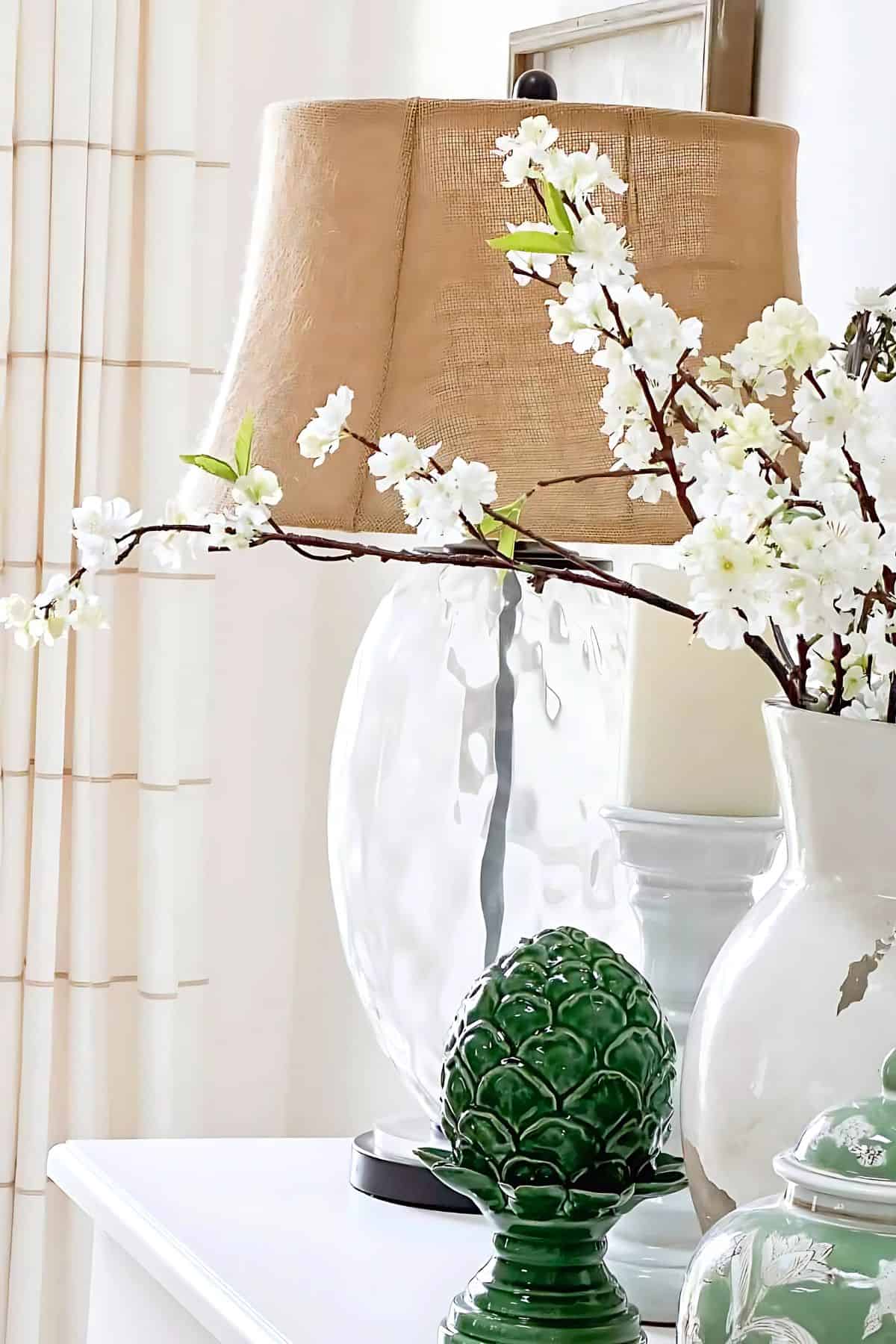
I love these gorgeous faux branches. They’ve been part of our spring decor for a decade! They were quite the splurge at the time, but given how many seasons they’ve graced our home, these pretty cherry blossoms have truly turned out to be a worthwhile investment. The branches are quite long, so I’ve curled them inside the vase, which not only adds to the aesthetic but also keeps them securely in place in the urn.
Spring Pillows
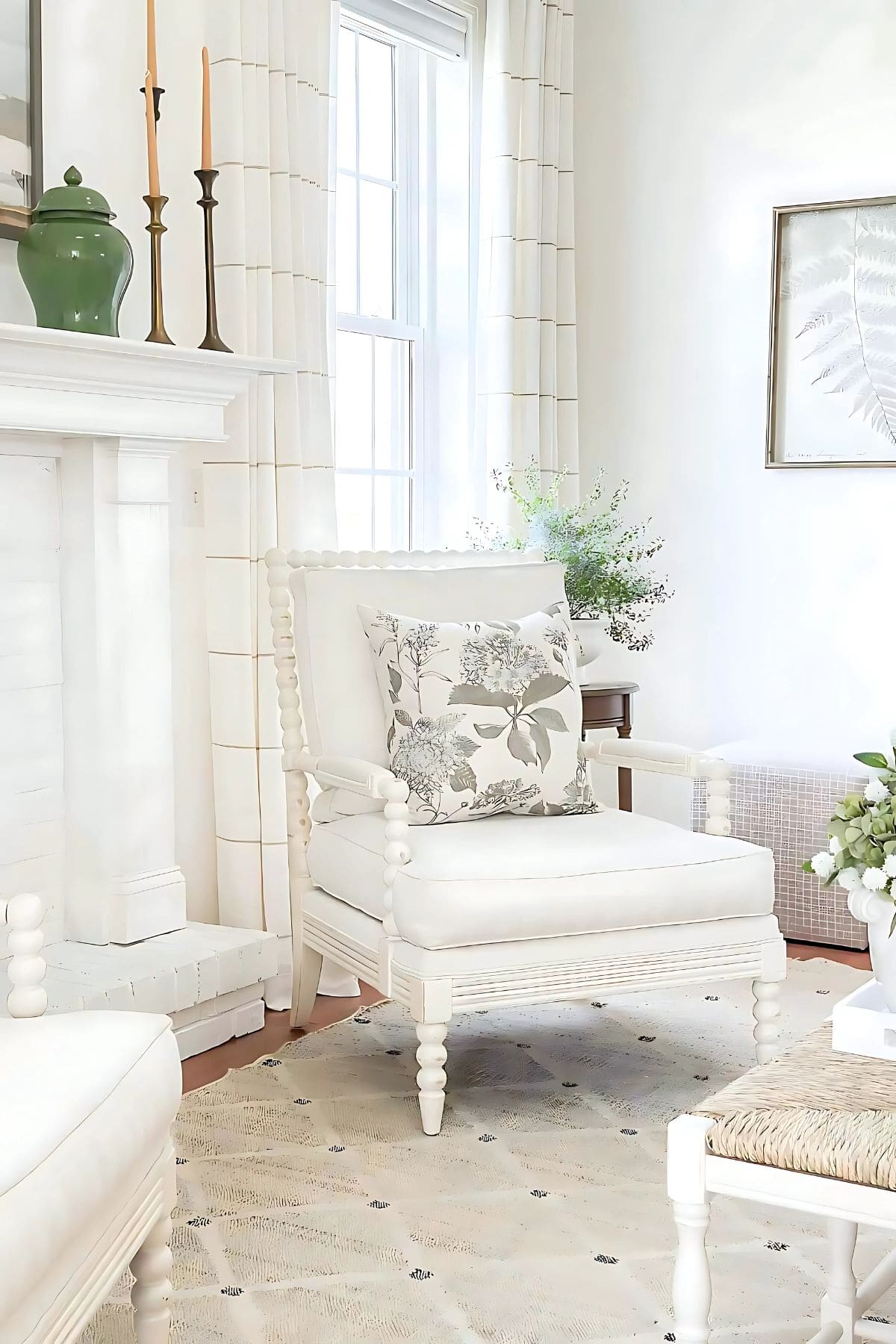
This season, I added a few new spring pillows to our sofa and spindle chairs. I have a bit of a pillow obsession! It’s incredible how they can transform the look and feel of a space almost like magic!
This year, my favorite picks found their spot on the spindle chairs. Their muddy green flowers with a charming vintage look add just the right spring look in our living room.
Currently, the trend in pillows leans towards a mix-and-match style, combining a hodgepodge of colors and patterns that don’t necessarily blend cohesively. While I can see the appeal of this trend, I’m not fond of it. I have trouble making sense of it.
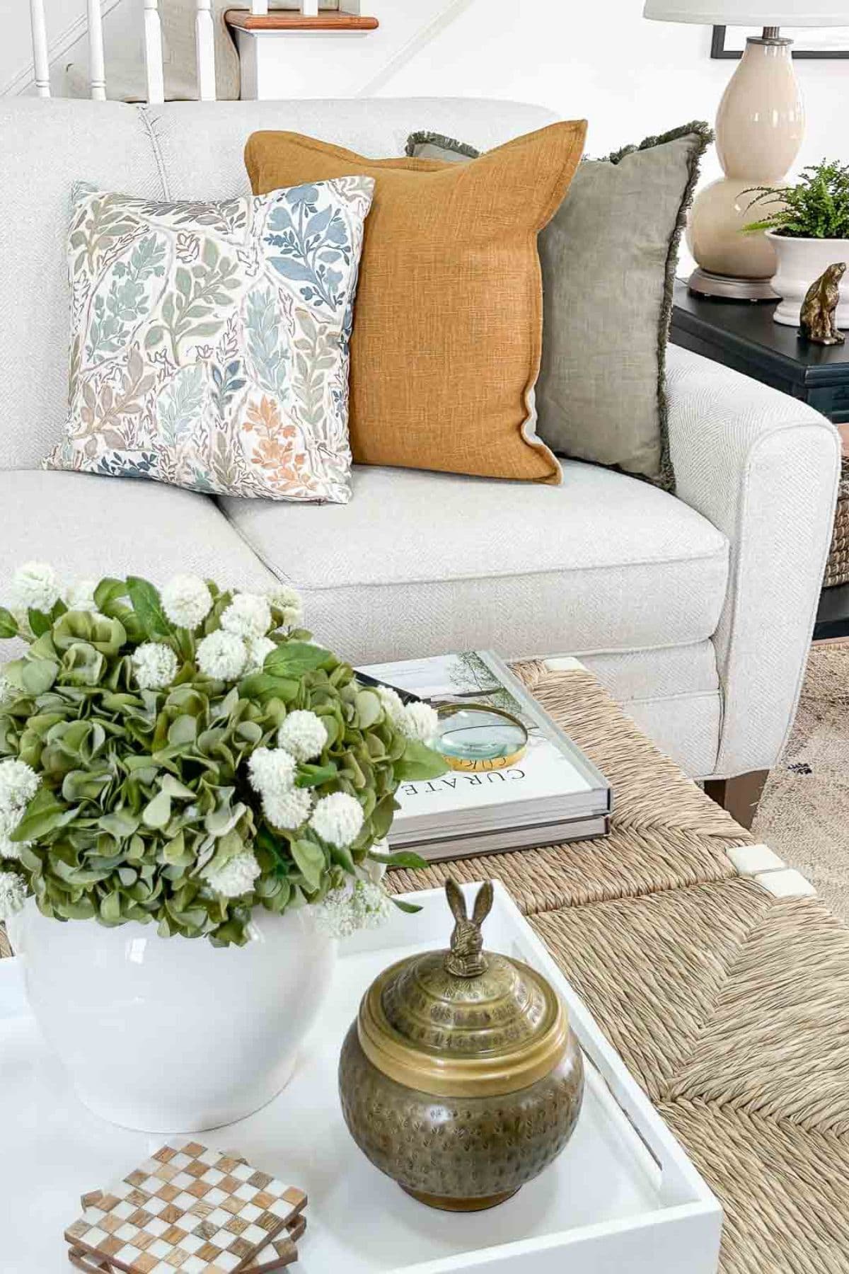
Have you ever found yourself trying to adapt to something you thought you loved but felt unsure about? That’s exactly how I’m feeling about the front pillow on our sofa. The colors blend beautifully with our spring living room, but the pattern is a tad too cute or stylized for my taste… or maybe it’s something else. What do you think?
Transitional Style
My decorating style leans towards transitional, neutral with a splash of color, and tailored. Our living room’s style is welcoming and unpretentious. We want guests to feel at ease the moment they walk in. I want them to grab a drink, find a cozy spot, and simply relax.
Like the rest of our home, this room is always evolving. I have a running list of changes and new ideas I’d like to experiment with here.
Decorating truly is a labor of love, my friend. I hope you find as much joy in it as I do, and may you never consider your home ‘completely’ decorated!
My Favorite Way to Decorate for Spring
Adding seasonal elements is one easy way to keep a room looking fresh, and it’s my favorite way to decorate. This spring, I did this by adding green to our living room.
Design Secret
One key to incorporating color or seasonal decor into your space is to spread it evenly throughout the room. As your gaze moves around, it naturally seeks out similar elements, and this harmony is perceived as visually appealing.
One of the most natural ways I’ve brought this hue into the space is through plants. Available in every conceivable shade and tint, it’s wonderfully easy to find the perfect green plant to suit any room in your house. Plus, the indoor greenery beautifully mirrors what we see just about to pop outside, creating a seamless connection between our indoor and outdoor spaces.
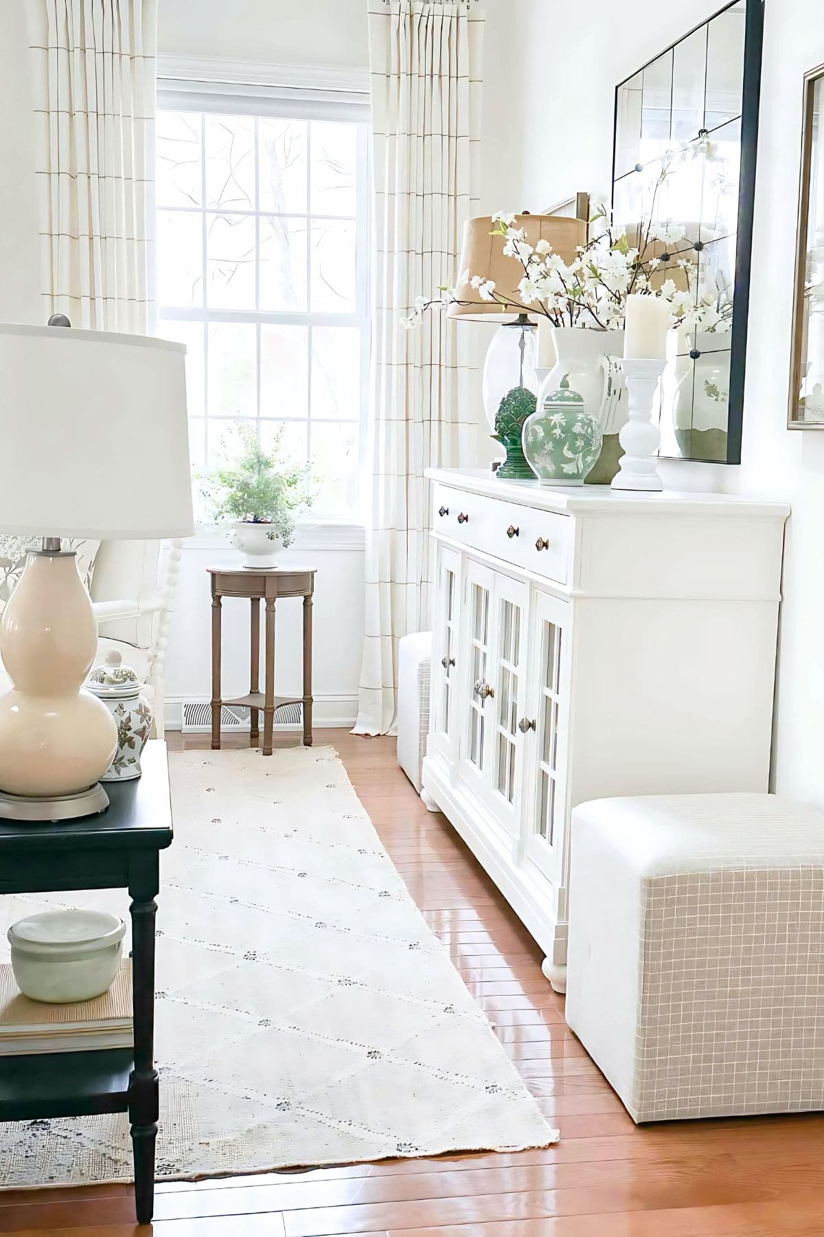
One particularly special plant is the fluffy one by the window. It started as a lavender Christmas tree and has since grown rather wild! Later this spring, it will transition to a new home in our foundation beds at the back of the house.
The 10th Coffee Table
For spring and summer, two rush-seat benches have taken on the role of our coffee table. This is the tenth coffee table that’s graced our living room. Last year, I used a single rush-seat bench, but I’ve been searching for something larger to connect the sofa and spindle chairs.
I’m particularly fond of our current makeshift coffee table. It’s large and has a light visual weight. Our home is open and filled with natural light, featuring plenty of windows. This setup means we must be cautious with dark furnishings, as too much can make the space feel heavy and enclosed.
Decor on The Coffee Table
Currently, my coffee table is styled with a selection of books and a long, bone-inlaid box on one side near the sofa, while the other side features a white acrylic tray holding various decor items. I often use the same books because they are favorites that I frequently pick up and reread again and again.
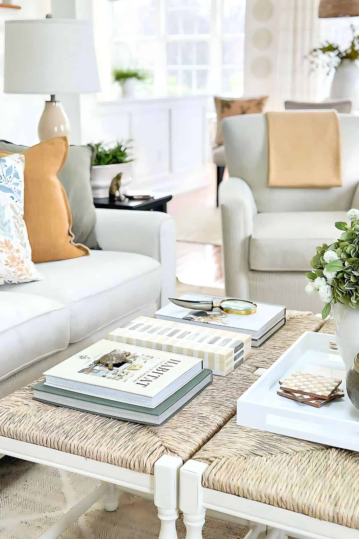
A tray is an excellent tool for any coffee table. It neatly gathers accent decor together into a cohesive vignette.
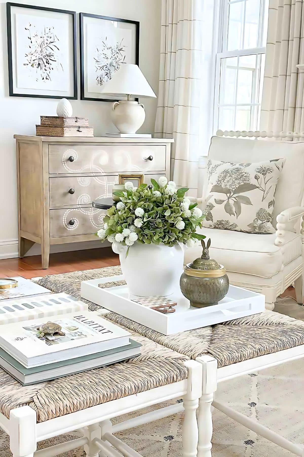
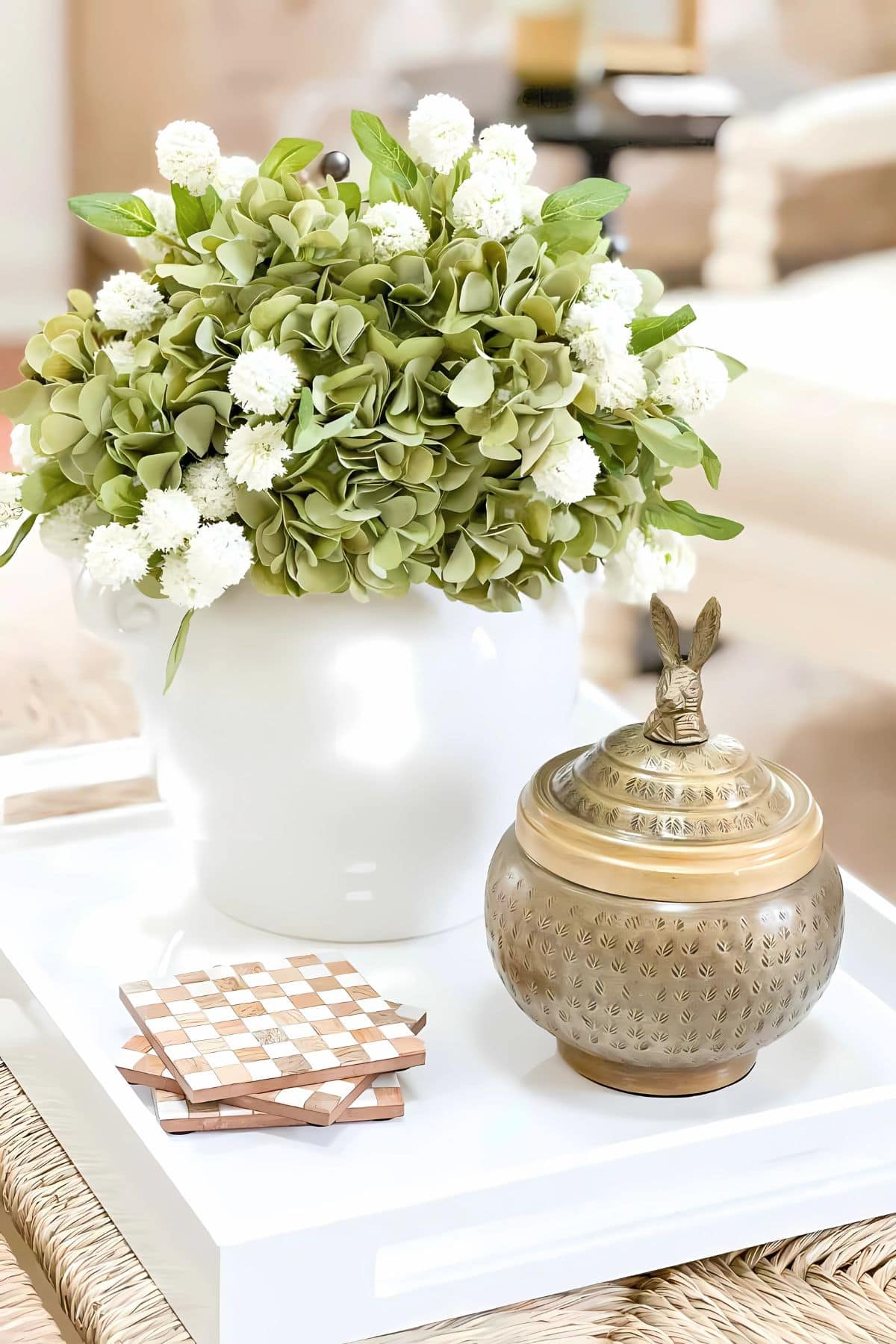
In my spring living room, the plants are real, though the flowers are not. I’ve filled a small urn with green faux hydrangeas and fluffy white ball-shaped blooms, which sit prettily in the white acrylic tray. I typically prefer real flowers, but since I couldn’t get to our local grocery store, these green faux hydrangeas were a wonderful substitute. The white blooms help balance the green hydrangeas from looking too heavy.
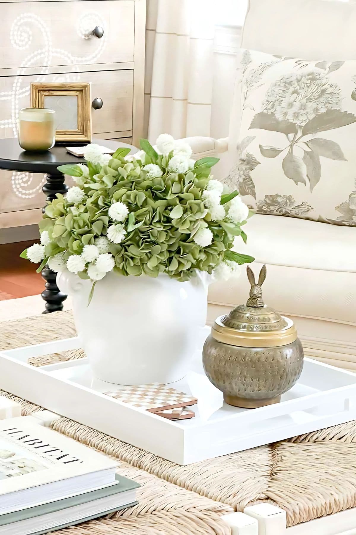
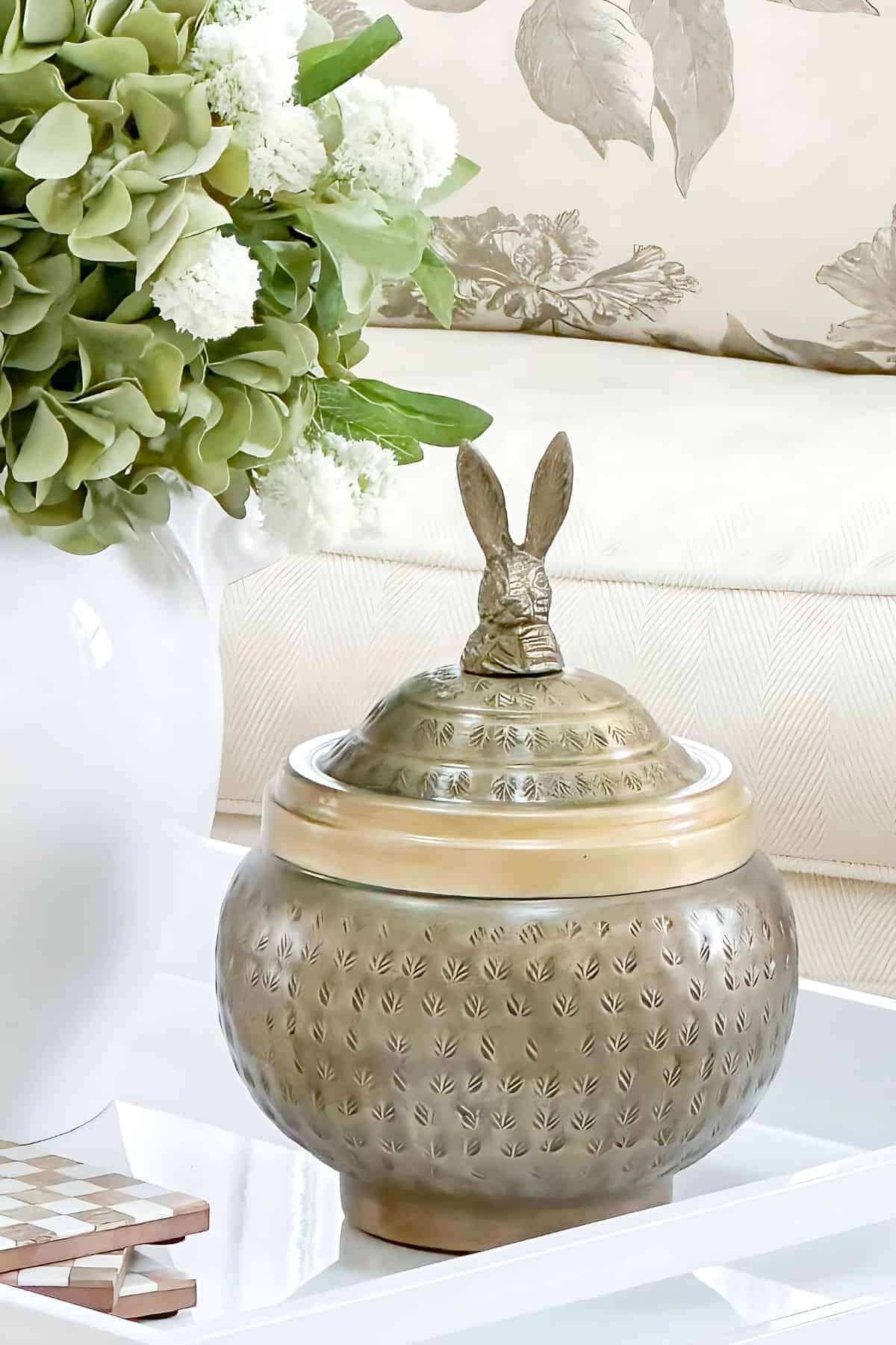
Beside the urn, I’ve placed a metal bunny container and a few checked coasters in the white tray. The bunny, which usually resides in our bookcase, makes its annual appearance every spring.
I find that arranging three items on a tray, particularly when they vary in height and texture, creates a visually pleasing display. This method is nearly fail-proof, as groupings of odd numbers, especially three, naturally appeal to the eye.
Giving Our Eyes a Decor Rest
In a room where the white buffet and coffee table are decorated with spring-inspired elements, the Curlacue chest serves as a visual pause. It’s important to remember that not every flat surface needs to be covered in seasonal decorations. In fact, a more minimalist approach is often the most attractive-looking approach.
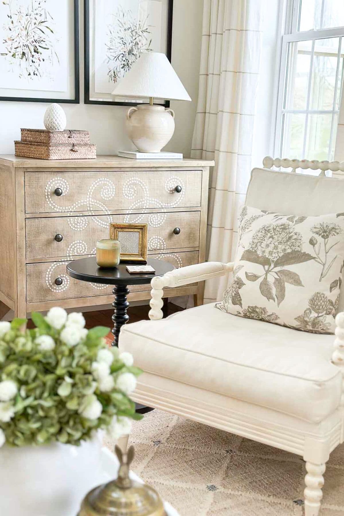
Currently, the only items on the chest are a lamp, a stack of wicker boxes, and a ceramic finial, shaped like a stylized egg, which subtly nods to the season.
The Mantel
This spring, I also introduced two small green ginger jars to the mantel, extending our theme of green for spring. Given the large artwork above the fireplace, I keep the mantel minimally decorated. This allows the artwork to command attention, so it remains the focal point without competition from other decor.
Next week, we will head into the dining room and kitchen for more of our 2025 spring home tour. The following week, I have a spring surprise in the foyer and a look at our spring front porch.
Shopping + Sources


Happy Spring, friends…

Love your designs! Bright and comfortable. Where did you source the small white flowers in the urn on your coffee table?
I found them locally. Sorry I do not have a source for you
Yvonne, I could just get lost in your beautiful home. Every post you do gives me inspiration how I can mix things up in our right-sized home. Thanks for all you do to bring Stone Gable to your readers.
Aww! What a sweet comment. This motivates me to bring you more! Thank you!
I very much love the two pillows you have – the neutral one in the spindle chair and the blue/green print on the sofa – exactly what I’ve been looking for. Will you say where you purchased them please? Thank you
I just added a shopping guide to the bottom of the post. It’s there! Happy Spring, Sandy.
I love the 2 rush seat benches as a coffee table!! Great idea and so happy you pointed that out. I see this idea in my home’s future. Thank you 🙂
You will love this! When we have lots of company, I can pull one of the benches away and use it as seating.
Love the ginger jars and the subtle touches of Spring. The green is refreshing and naturally organic. You are still my go to most mornings, after devotions. Love it all.
How dear, Jane! Thank you for being a faithful part of our StoneGable family.
I see that you have a new photo above your mantle and got rid of the word art. I read that word art is “out” now. Do you think I should remove the ones I have for a more updated look?
Barb, do what makes YOU happy. The minute that your “word art” doesn’t put a smile on your face when you walk into the room, then realize it might be time to get “updated.” Plus, you can always relegate it to being a less “focal point” in the room to a supporting role in your decor, especially if it is a treasured saying or memory. I think that we forget that bloggers MUST stay somewhat trendy because of view numbers and sponsors. The “normal” person doesn’t live like this. So, gather great info from experts like Yvonne, but DO YOU. I know she would and has said the same thing. 😉
Thank you Deb. I needed to hear this.
Very wise advice, Deb.
Do what you love Barb! I fell in love with this piece of art. It reminds me of home.
Hi Yvonne
I actually like the floral cushion on the sofa very much. I find the two solid coloured cushions behind it a little “heavy “ paired with it in such a light bright room. Perhaps that’s what bothers you about it. But of course, the whole room is just lovely.
I agree with the heavier look. Not until I saw the images did I see it too. Thanks.
Hi Yvonne. I see what you mean about the colorful pillow. What if you just left the green pillow in place and added a white and sand textured pillow? Then maybe a smaller pillow with a light hint of color? Loved the post!
Great ideas, Lynette. Thank you so much for your idea.
HI!
LOVE, love, love the green! And I’m so happy to see it. In the fall, I painted our powder room green, and more recently I’ve been gethering green objects and pillow covers for my spring and probably summer bedroom. As always, your home is gorgeous and full of so much inspiration! Thank you for sharing your talents.
Thanks, Judy. I bet your powder room is lovely.
I absolutely love your home and have followed you for years. Your decorating style is stunning. I live in an apartment and some of your ideas require a house so I was wondering if you had any ideas that I could use for apartment living. Any ideas would be greatly appreciated.
Linda
Many of the ideas will work for apartments. Especially ideas in my sunroom, dining room, and master bedroom. Every home is different so if you like an idea tweak it for for your living space. There are so many posts with ideas for small room decorating. Spend a little time going through the blog and pick out posts that will work for you and inspire you. Hope this is helpful.
I love the fresh green accents. I’m learning so much from you! I don’t want to hurt your feelings — the front pillow on the sofa might be a bit stylized, but it’s a pretty spring floral. I do not like the center pillow ( natural color). It seems off with the other 2 pillows. But again, I’m learning. Thanks for your inspiration as I decorate my neutral home.
I’m so glad you are learning! So am I, and I thank you for your good pillow advice. xo
I want you to know how much I love your “new” style! What I mean by that is the addition of color and infusion of new “fun” in your spaces. I’ve always loved your style, from the Stone Gable home to Tanglewood. But for quite awhile it seemed like you limited your decor to only whites and neutrals. I just love the color and pattern I’m seeing. Thank you for the inspiration!
Thanks, Laura. I LOVE color too, but it fights with all the windows and the views outside. I tried to add blue (LOVE) but it just did not work. Green seems to seamlessly work with my focal point- what’s outside.
My dear friend, your Spring living room is perfection! I LOVE the introduction of the green! I also have a question: what is a Lavender Christmas tree? I am guessing a lavender bush shaped into a tree?? I also would LOVE to get together!!! It’s been WAY too long. Let’s make it happen!!!! I miss you. XO, Pinky
Aww, thanks dear friend. Yes, a lavender Christmas tree is just what you said. I let it grow and it went wild. Please call me and lets get together. SOON! xo
When I saw the beautiful artichoke and ginger jars I expected to finally to see the oversized woodblock Studio McGee pillow you had posted about purchasing a while back. I really think that pillow would complement the other pillows, drapes, wood floors and the brown tones in your dining room. Just my two cents since you asked about the sofa pillow!
Hi Diana, that pillow is in our sunroom. Great idea! Thanks.
Kind of obsessed with that pot of green hydrangeas and from this side of the screen appears to be white billy balls. Isn’t it great that something so simple can be so beautiful… love how those little things inspire.
Thanks, Jan. I looked up Billy Balls and I thinky you are right! Again, thank you.
I love that you added both drapes to your windows. To me it gives a calmness. Your decorating is always so inspiring-I love your style.
Thank you so much C! Our Tanglewood House has taken me so long to re-train my brain to the style. I’m glad you like the drapes… so do I!
Yvonne, where did you get your living room rug and what colors are in it? It’s pretty.
Hi Ginger, the rug as beautiful wam shades of brown and cream. Here’s the link:https://rstyle.me/+AJXNGIKULBW9D8XOAYL-yA