Contrast In Decorating: How To Make Every Room More Interesting
Contrast is one of the simplest interior design principles to learn, and one of the most powerful. Discover how to use color, texture, shape, and scale to create a room you truly love spending time in.
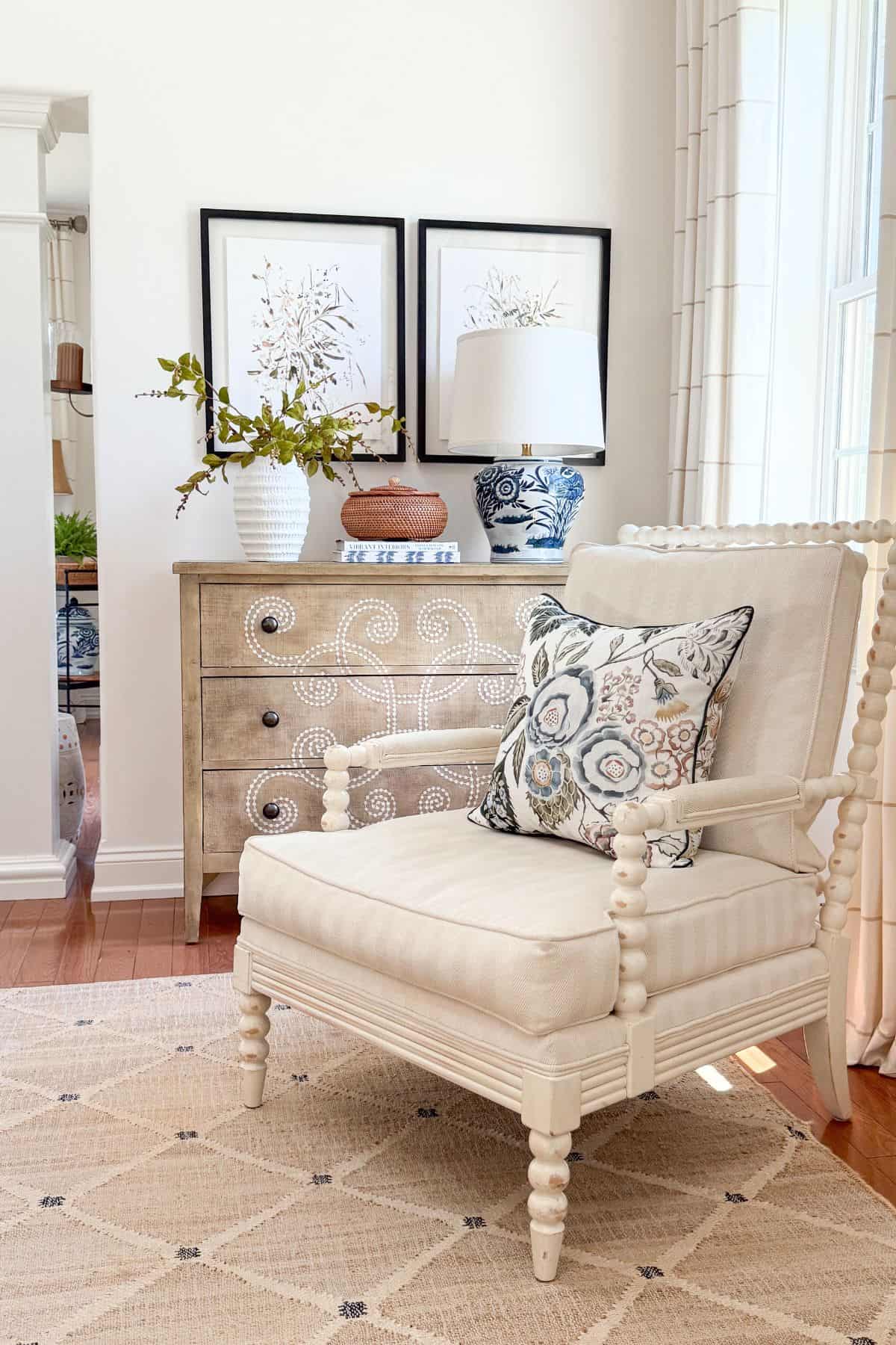
Contrast has a way of pulling a room together and making it feel finished. It creates interest, depth, and beauty, and once you understand how to use it, you will start to see it everywhere.
Think of contrast as a push and pull that keeps a room from going flat, one piece asking for attention while another lets it happen while being supportive. It might be the missing piece that takes a room in your home from good to truly inviting, and it is so easy to learn and use.
This post is part of a series called DECORATING SCHOOL. I have compiled a decorating course to help you become a more confident home decorator. You can decorate. You can create a home that is comfortable and beautiful, one that reflects your unique personal style. I will show you how.
Ready to use contrast in your home?
My superpower is breaking down interior design concepts into easy-to-understand, doable, and repeatable steps. So let’s break down contrast, one type at a time, so you can start using it in your own home.
My superpower is breaking down interior design concepts into easy-to-understand, doable, and repeatable processes. So, let’s break down the concept of contrast in decorating so we can use it in our homes!
What Is Contrast, And Why Is It Important
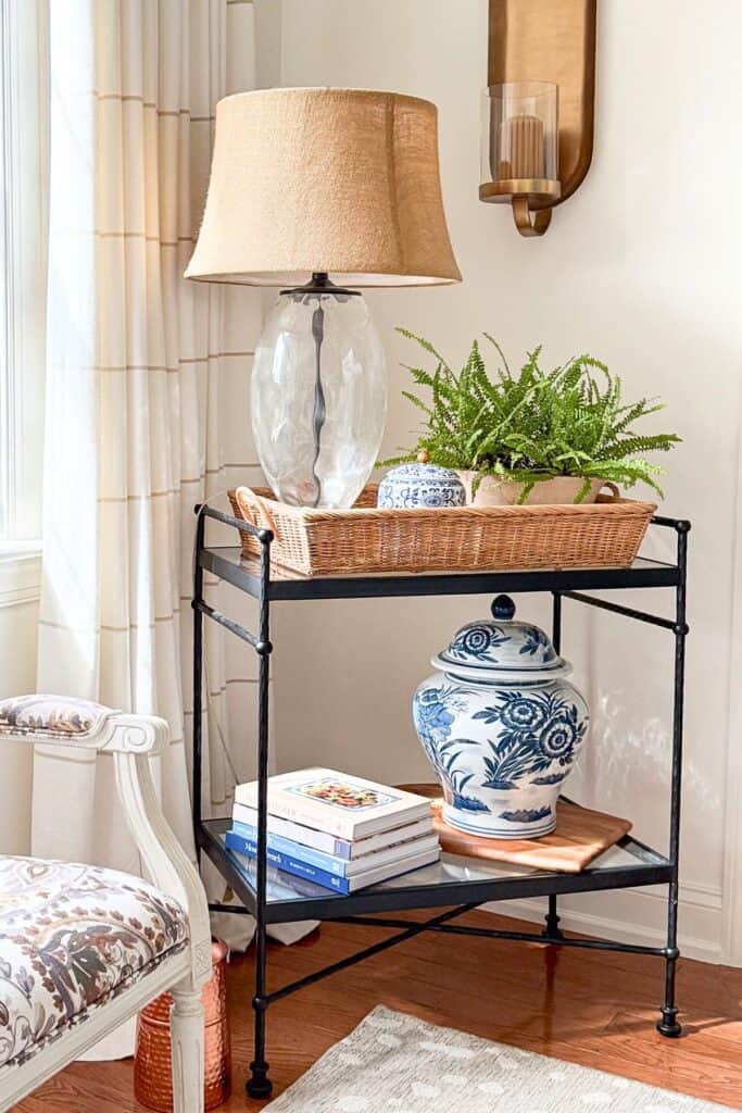
Before we look at the different types of contrast, it helps to know exactly what we mean by the word, and why our eyes respond to it the way they do.
Contrast is arranging items with different or often opposite characteristics together in a room to create impact. It’s that easy!
When we talk about contrast in decorating, we are talking about one of the most important ways to create an interesting home. Our eyes pick up on contrast without us even realizing it, and when there is enough of it in a room, our brains find that room interesting. And interesting things read as attractive to us.
When everything in a room is the same, our eyes tend to skip right past it. Same color, same size, same shape, no contrast, no interest. One of the simplest ways to make a room more attractive is to give your eyes something to notice.
We talk about this eye-mind connection a lot here at StoneGable. There are foundational design concepts that make decorating make sense, and contrast is one of the biggest ones. When it is used well, the visual impact on a room is significant. Without it, a room can miss out on one of the elements that makes a space feel lovely and alive.
The good news is that contrast is one of the easiest design principles to add to any room, no matter your style or budget.
🌿 TIP BOX: If a room feels a little flat, ask yourself what is missing: a pop of color, a change in texture, or a different shape. That one addition is often all it takes.
Most Common Types Of Contrast To Use In Your Home
Now that you know what contrast is, let’s look at the most common types you can use to create rooms that feel layered and beautiful. These are so easy to not only understand, but put into practice in your home.
🌿 TIP BOX: You do not need to use every type of contrast in one room. Pick one or two that your space is missing most, and start there.
Color
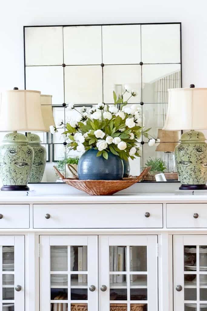
Over the last little while, I have really had fun infusing our home with more color. It is probably the easiest way to add contrast to your home. But just a word of caution: do not make it the only way you add contrast.
One of the most accessible ways to add contrast to your home is with color. Think of how striking black-and-white rooms look. That is a contrasting color combination at its simplest. Black and white feels dramatic and sophisticated because our eyes notice the color difference right away.
Light and dark combinations create high contrast, and using a complementary color scheme, colors from opposite sides of the color wheel, is another easy way to bring contrast into a room.
These color pairings create strong contrast:
- red and green
- purple and yellow
- blue and orange

A word of caution here. If you love color and want to use complementary colors to create contrast, one color should be dominant and the other the accent. One should only appear as a pop, while the other can be used more generously throughout the room. That tension and balance, done in the right amounts, is what creates real beauty in a space.
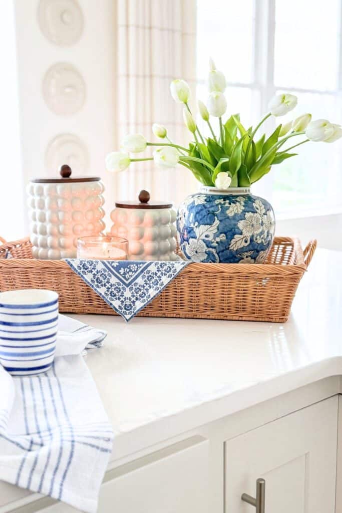
Color has a significant effect on how a room feels. Choose a palette that creates a welcoming, comfortable place to spend time.
You might also like Mastering The Art Of Choosing The Perfect Color Palette.
🌿 TIP BOX: If you love color but feel nervous about using a lot of it, start with one complementary pop, a pillow, a vase, or a piece of art, before committing to anything larger.
High/Low Contrast
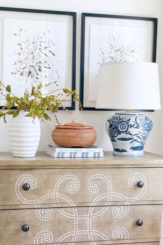
This is another one of my favorite ways to add contrast to our home. The secret is to have a good sense of your decorating style; then you can mix in the unexpected with confidence, rather than it feeling random.
Mixing high-end or luxury-looking furnishings with ordinary, utilitarian, or everyday items creates a distinct juxtaposition that is bound to be noticed. The contrast is easy to see and creates a lovely, layered look.
It is that old adage about opposites attracting. A beautifully upholstered chair with a straw hat tossed on it. A velvet blanket paired with a nubby pillow. A crystal goblet holding paper straws. Or statement spindle chairs with an inexpensive Amazon pillow and a repainted garden stool.
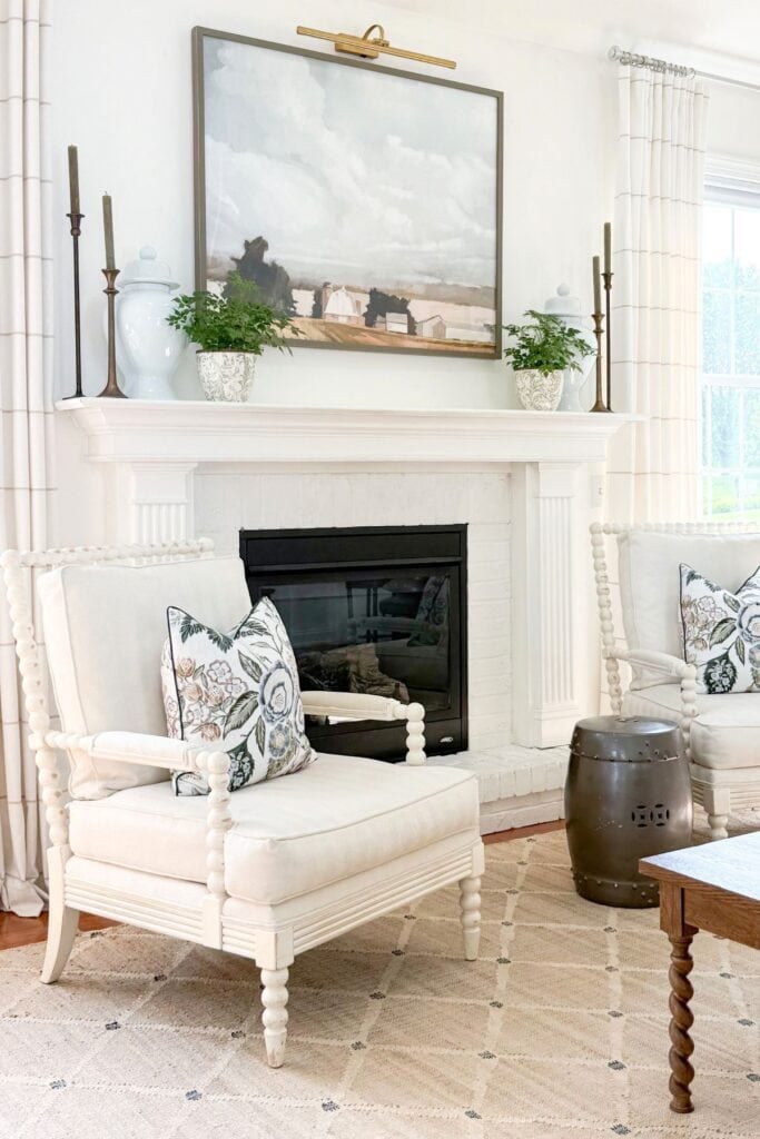
This high-and-low mix is charming and a little unexpected. It is also a savvy way to add contrast to any room in your home.
🌿 TIP BOX: Once you know your decorating style well, mixing high and low pieces gets much easier. You will start to see which unexpected pairing feels right, rather than just guessing.
Contrasting Home Decor Finishes
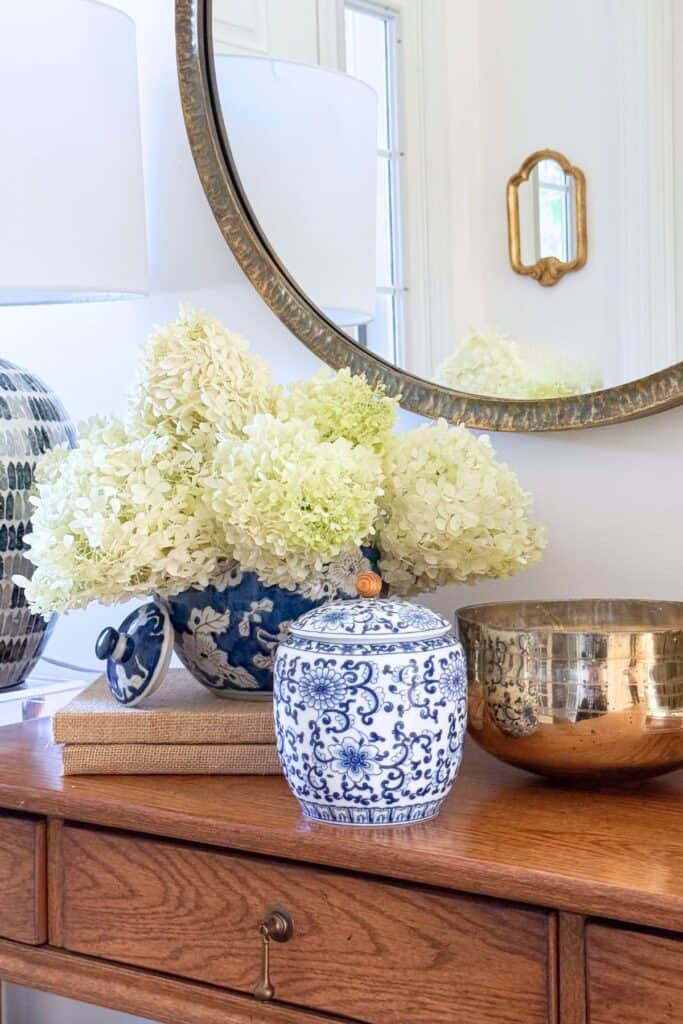
This tip is easy for me when it comes to the metals in our home. I just do not pay much attention to them, and it works. I also really like mixing different finishes throughout our home. Wood in various tones and painted furniture fill our rooms, making our home feel interesting and personal.
Another way to create contrast is by combining different finishes throughout a space. It is no surprise that matte walls pair so well with high-gloss woodwork. Introducing a variety of finishes within a room adds depth and visual appeal that a single finish simply cannot offer on its own.
If brass fixtures dominate your bathroom, for example, the principle of contrast suggests adding a few accessories in a different metal to bring in more visual interest. A room filled with all matching materials can start to feel flat. Contrast brings a room to life and gives it personality.
🌿 TIP BOX: Do not worry about matching every metal or finish perfectly. A relaxed mix, done with a little intention, often feels more collected than a room where everything matches exactly.
Textural Contrast
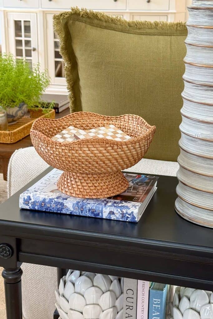
Texture, more than any one thing in our open concept, semi-neutral home, adds overall interest and warmth to each room. Adding texture used to come naturally, but once I learned to use it well, I became very intentional about making sure every room has enough of it. Texture does not call attention to itself the way a pop of color does. It is quiet, but it is very powerful.
This is the number one way I add contrast to my neutral home.
We can actually feel something when we see it. Our brains perceive rough, lofty, shiny, smooth, gravelly, bumpy, silky, complex, and so much more, often before we consciously notice it.
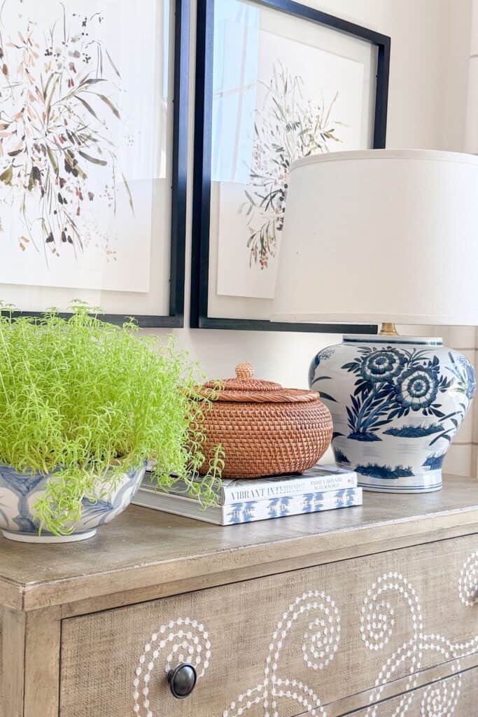
A room needs a mix of textures- bumpy, soft, rough, smooth- all layered together, because our eyes are drawn to texture instinctively. Without variation in texture, a room can start to feel flat, and our minds get bored. Think of how beautiful an oriental rug looks against a hardwood floor, or a velvet pillow on a wooden chair. That is texture and contrast working together.
If you have a neutral palette in your home, texture becomes even more important. It is very much apparent to me that texture is what keeps my home feeling interesting, and it often takes the place of color.
🌿 TIP BOX: If your home leans neutral, texture is not optional; it is essential. Layer in at least three different textures in any room to keep it from feeling one note.
Contrasting Shapes
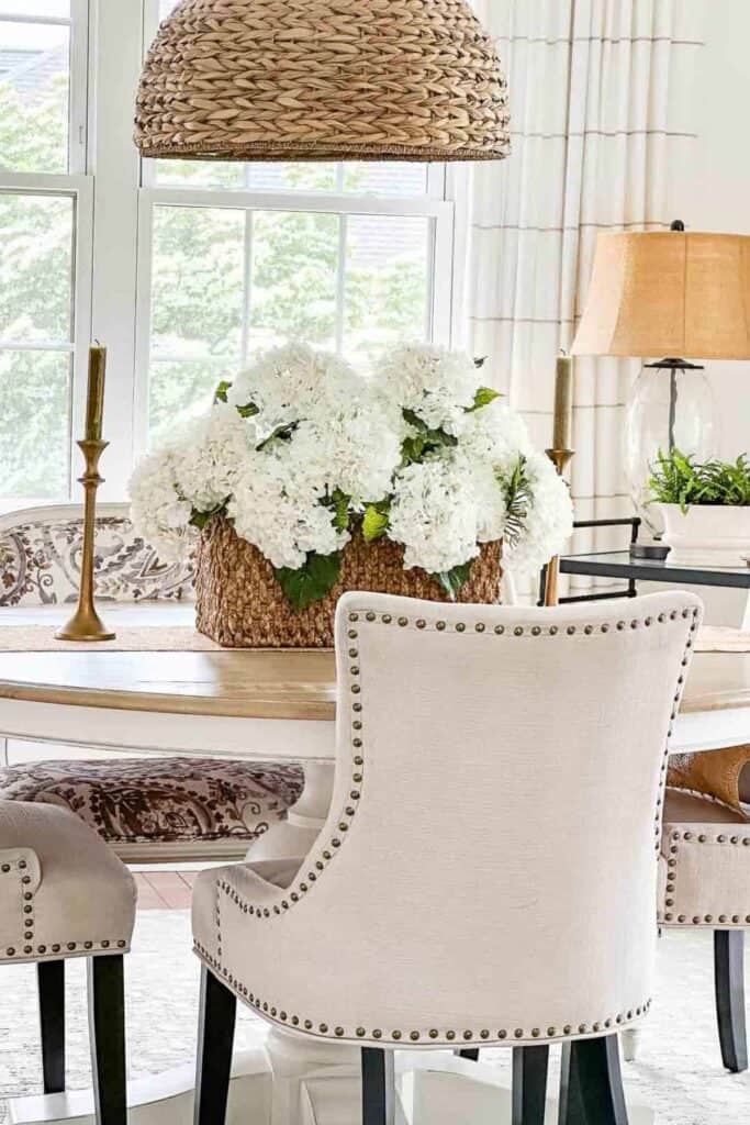
Because our home is open concept and on the smaller side, I realized that too many repeated shapes started to look odd rather than intentional. So I like to use rectangular end tables that are not too far from our round dining room table, and a square wooden coffee table sits near them. Repeating shapes does help the eye move through a room, so I repeat accent decor that complements the shapes of our furniture instead of matching every piece exactly.
Our eyes and minds are always trying to make sense of what they see, and one of the biggest ways they do that is by looking for repeated elements in a room.
When our eyes find the same shape repeated, they move around the room more easily, which is exactly what we want them to do. That repetition reads as attractive because our minds can make sense of a room through shapes, colors, and textures that echo each other.
But like most things in decorating, there is a balance. If every shape in a room is the same, our eyes can get bored just as easily, and the room reads as flat instead of interesting.
So it is smart to repeat shapes in a room, and it is just as smart to add one that is different. A round mirror is a joy to add to a room full of rectangular furnishings. That one shift is often all a room needs.
🌿 TIP BOX: In smaller or open concept homes, repeated shapes can start to look accidental rather than intentional. Choose one or two shapes to repeat on purpose, then add a single different shape to keep the eye moving.
Scale and Proportion Contrast
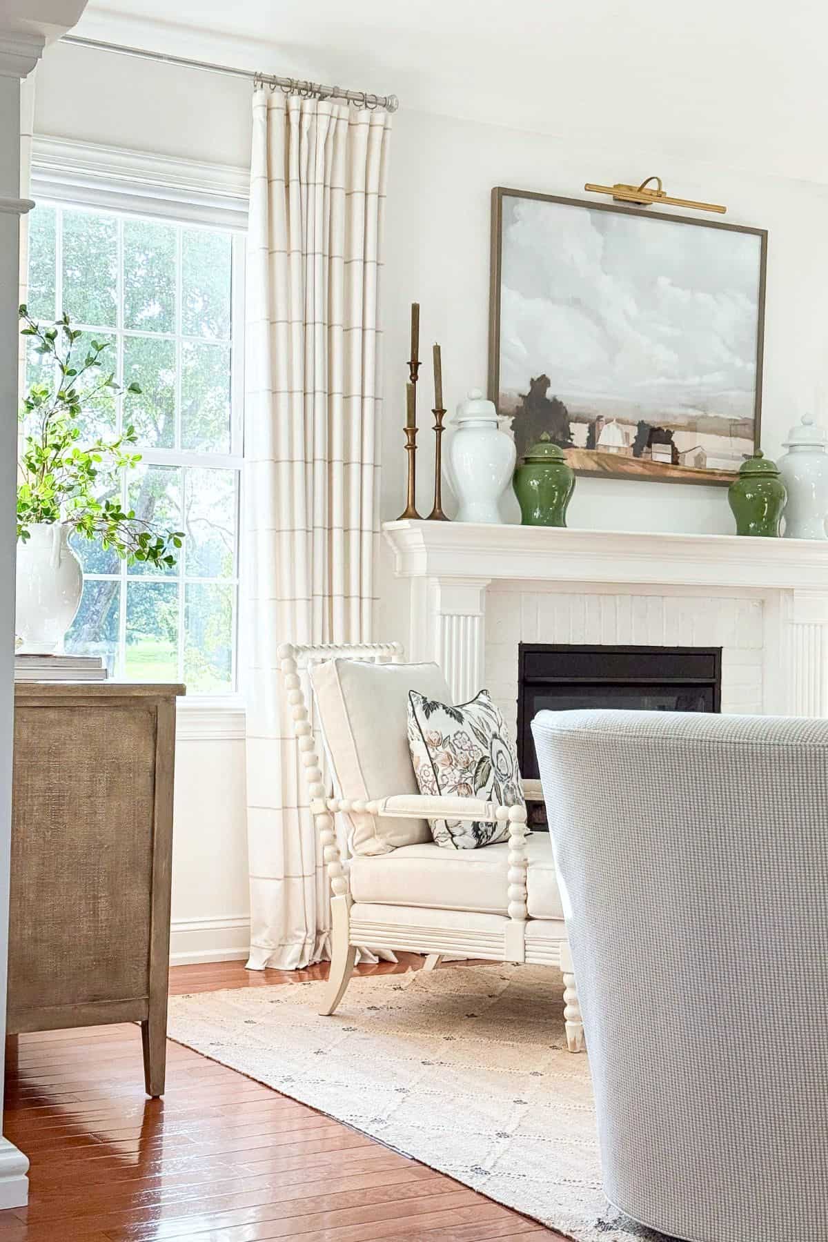
Scale and proportion might be the most overlooked way to add contrast to a room, but once you start noticing it, you will see it everywhere in rooms you love.
Before we talk contrast, it helps to know that your foundational furniture, your sofa, chairs, and case pieces, should already be the correct proportion and scale to one another and to the other key pieces in the room. That relationship needs to work well together first. The contrast comes in through your accent decor.
This type of contrast is simply pairing small, delicate accents with something bold and oversized. A large piece of art hung above a low profile sofa. A lumbar pillows tucked in front of big, generous throw pillows. A slim lamp standing next to a substantial stack of books.
The difference in size draws the eye and adds a sense of drama that a room full of matching proportions simply cannot create on its own. It also keeps a space from feeling predictable, since our eyes naturally want to compare one piece to another.
A simple place to start is your seating area. Once your furniture proportions feel right together, look at your accents, a side table, a lamp, a stack of books, and choose one that plays against that scale instead of matching it.
🌿 TIP BOX: A single oversized accent, like a large mirror or an armful of tall branches in a vase, can instantly add scale contrast to a room full of smaller, similarly sized furnishings.
Style Contrast
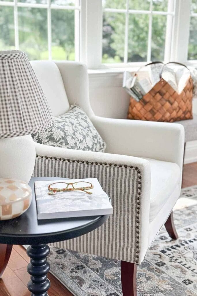
One of the best decorating things you can do is nail down your decorating style, then add a couple of pieces in a different style into a room. I do this in every room. It keeps a space looking interesting and prevents it from feeling like it was pulled straight from a catalog.
Style contrast simply means placing a piece from a different design era or aesthetic into a room that otherwise reflects your main style. A modern light fixture in an otherwise traditional room. An antique chest in a room full of clean lined furniture. A carved wooden stool next to a sleek upholstered sofa.
Once you know your own style well, this becomes much easier to do with confidence instead of guesswork. That one piece from a different style does not fight the room, it gives it a story.
Rooms that feel curated over time, rather than bought all at once, almost always have a bit of style contrast working in the background. It is one of the quiet ways a room reads as personal rather than staged.
🌿 TIP BOX: If every piece in a room matches in style, look for one item, an antique frame, a modern lamp, a rustic bench, that plays against the rest. It adds character instantly.
Mixing And Matching
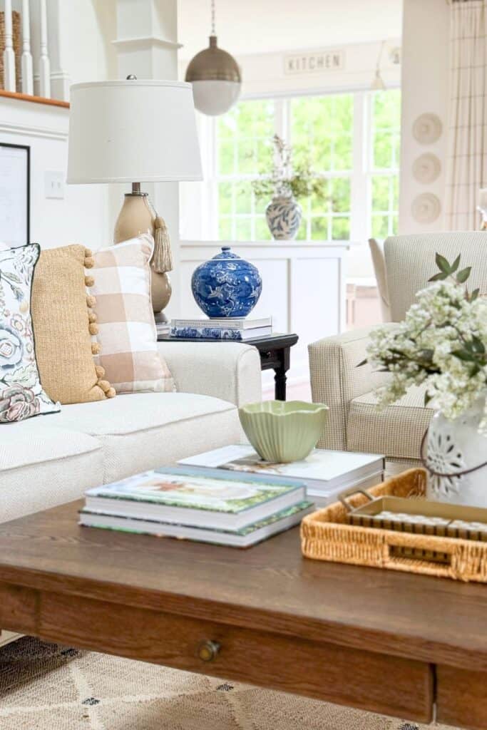
There is also contrast to be found in mixing and matching a few other elements throughout your home.
Here are just a few worth paying attention to:
- patterns and textiles
- positive and negative space
- metal finishes in a room
- more than one style of furniture
- a variety of plants and flowers
Each of these offers a small, easy opportunity to bring in a little more contrast, without needing to overhaul an entire room.
🌿 TIP BOX: Pick just one item from this list to focus on this month. Small, intentional changes add up to a room that feels layered and complete.
How Lighting Affects Contrast
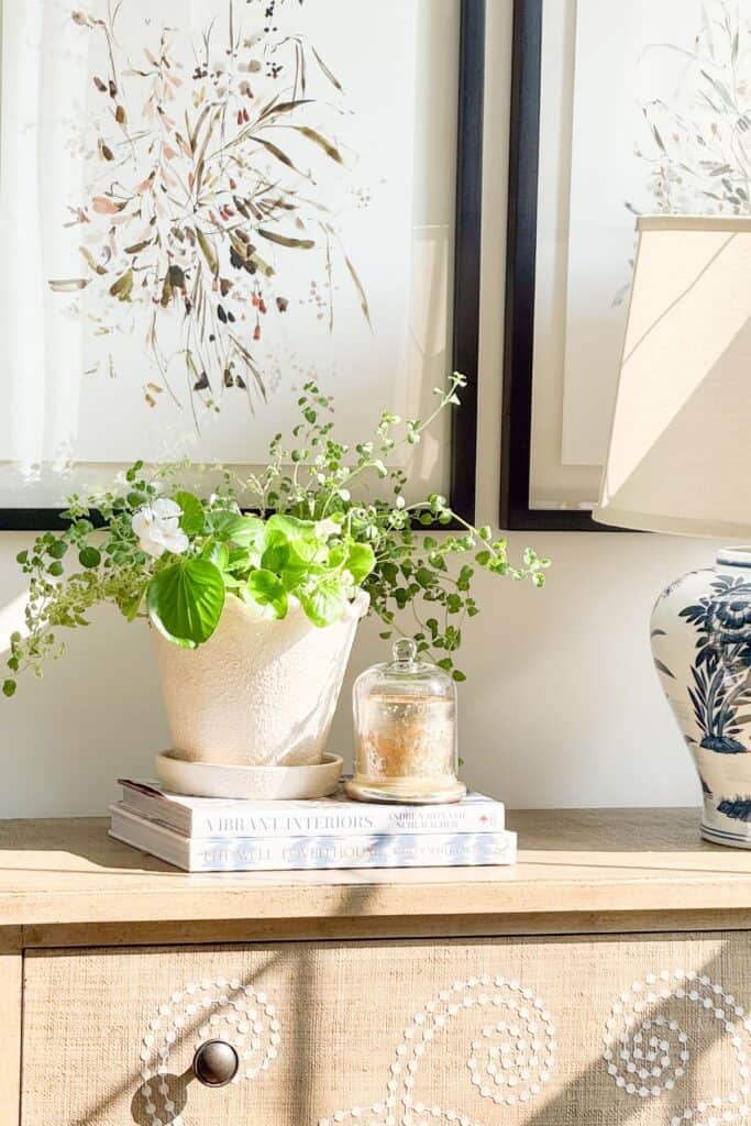
Lighting is what actually makes contrast visible, so it is worth paying attention to before you decide your color and texture choices are finished. I love how our home changes during the day, and with the lamps on in the evening.
Daylight tends to enhance natural textures. It shows off the grain in wood, the weave in a linen pillow, the nap of a velvet chair. If you are relying on textural contrast in a room, natural light is your best friend.
Artificial light can either soften or sharpen the contrast you have created. Warm light tends to blur edges and bring pieces closer together in feel, while cool light sharpens lines and makes contrast read as more dramatic.
Before you finalize a paint color, a custom fabric, or a furniture arrangement, it helps to look at it in both natural and artificial light. A pairing that feels bold in the afternoon sun might feel completely different by lamplight in the evening.
🌿 TIP BOX: Test any high contrast pairing, like a dark accent chair against a light wall, at different times of day before committing. Lighting can make or break how well contrast reads in a room.
How Much Contrast Is Too Much
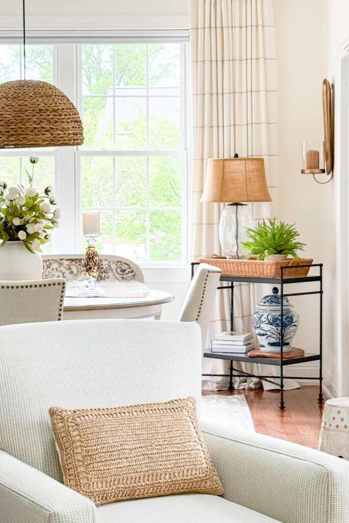
A beautiful home is a balance. As long as a room feels comfortable and balanced, I know the contrast is right. But when something feels just a little off, I ask myself, is there too much contrast here? I can usually feel and see the answer. Maybe I need more color contrast, or maybe I have too many pieces of accent decor that are all rectangles or all circles. These are easy, quick fixes.
A simple guideline to keep in mind is a rule of thirds. Roughly a third of any pairing, colors, shapes, or textures, should be the contrasting note, while the rest stays more consistent. This keeps a room feeling intentional instead of chaotic.
Too much contrast can leave a room feeling busy or unsettled, while too little can leave it feeling flat and forgettable. The sweet spot is somewhere in between, and your own sense of comfort in a room is usually the best guide you have.
If a room feels like too much, look for the element that is competing the hardest, a bold color, a busy pattern, a repeated shape, and simply dial it back. If a room feels like too little, that is your cue to add just one contrasting piece.
🌿 TIP BOX: When in doubt, remove one item rather than add one. Often a room has too much competing for attention rather than too little contrast.
How To Use Contrast In Your Home
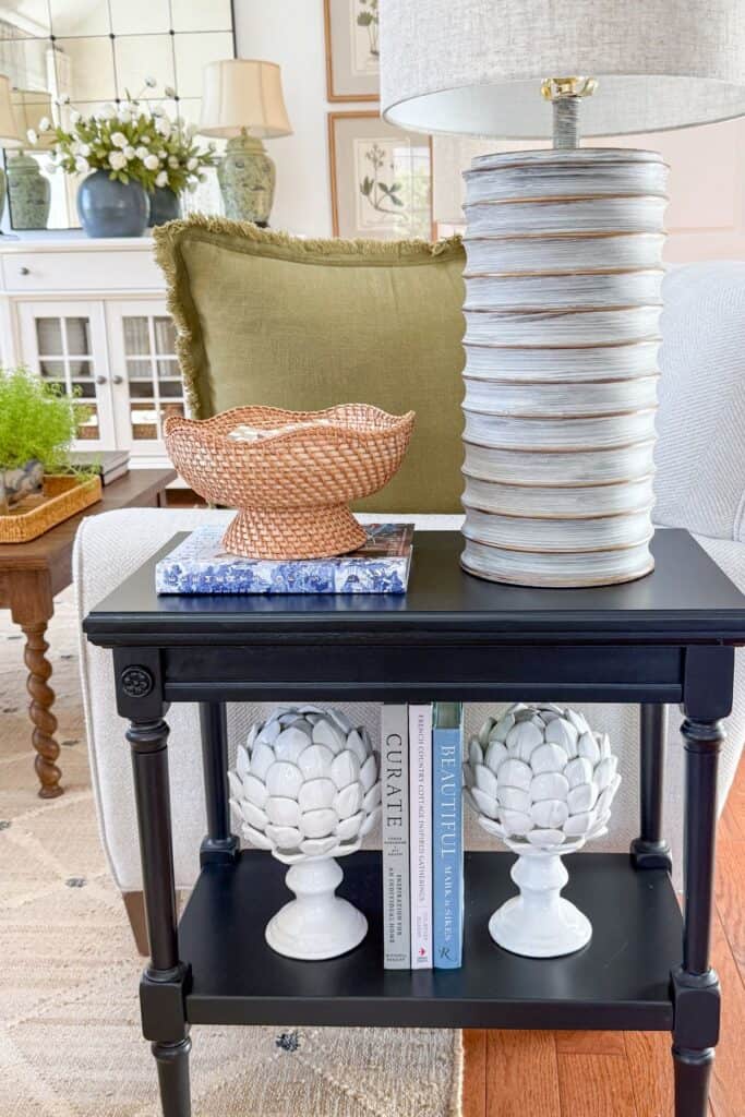
Now that you know the different types of contrast, let’s talk about using them in your own home.
Every room needs some contrast. The more similar the things in a room are, the more contrast you should add. If a room already feels layered and full of life, there is a good chance contrast is already at work in it.
Every room does not need to use every type of decorating contrast, though. Start by being aware of what your room might need most.
My home celebrates neutral, accented with a bit of color, so it needs lots of texture.
Pay attention to where a pop of color could help, and to whether your metals, like drawer pulls, curtain rods, and nailheads, could use a little variety. Think about where a high and low mix might fit, or where scale contrast could add interest. A little goes a long way.
Using contrast well can take a room from ordinary to memorable. By thoughtfully combining color, texture, shape, scale, and style, you create a room that feels cohesive, yet interesting, and one that reflects your personal taste.
Remember, balance is the key. Too much contrast can overwhelm a room, while too little can leave it feeling flat. Experiment with a few elements at a time, and trust what feels right in your own home.
Ready to bring more contrast into your home? Start with just one room, and notice the difference it makes.
🌿 TIP BOX: Choose the one type of contrast your home needs most right now, whether that is texture, color, or scale, and start there before adding anything else.
A Few Common Contrast Questions
Here are a few of the questions I hear most often about contrast in decorating, along with straightforward answers to help you feel confident using it in your own home.
Yes, contrast actually helps a small space feel more defined rather than cramped. Use lighter and darker shades to create depth, and keep the bolder contrast to just a few pieces. I use this trick often in our own smaller, open concept rooms.
Contrast adds visual interest by highlighting the differences in colors, textures, and shapes in a room. It keeps a space from looking flat or forgettable, and it is one of the quickest ways to make a room feel finished.
Subtle contrast involves smaller differences, like varying shades of the same color or mixing a matte finish with a glossy one, for a softer, more understated effect. This is where I spend most of my time in our own home.
A helpful guideline is a rule of thirds, roughly a third of any pairing should be the contrasting note, while the rest stays more consistent. If a room feels chaotic rather than layered, that is usually a sign to dial one element back.
Absolutely, and it might matter even more in a neutral home. Texture becomes your best friend here, since it adds contrast quietly without introducing more color. This is exactly how I keep our neutral spaces feeling warm rather than flat.
Lighting is what makes contrast visible in the first place. Daylight tends to enhance texture, while warm artificial light softens contrast and cool light sharpens it. I always test a bold pairing in a room at different times of day before I commit to it.
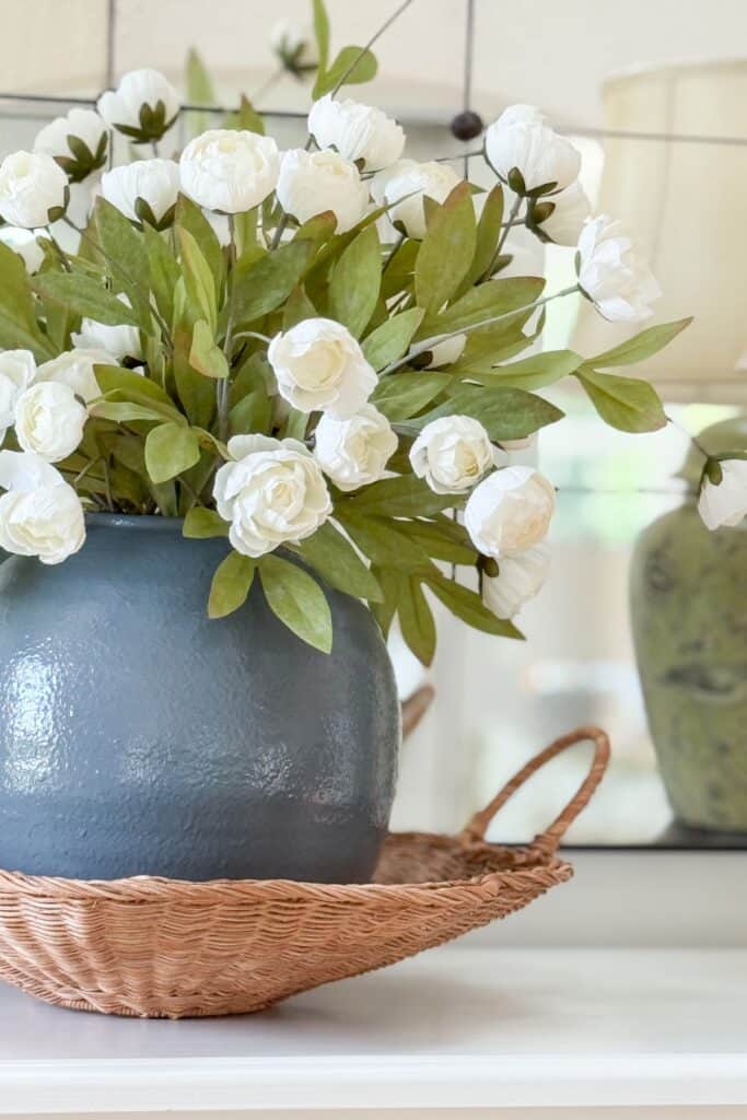
Using contrast when you decorate can take a room from ordinary to memorable. By thoughtfully combining color, texture, shape, scale, and style, you create a room that feels cohesive and reflects your own personal taste.
Remember, balance is the key. Too much contrast can overwhelm a room, while too little can leave it feeling flat. Experiment with a few elements at a time, and trust what feels right in your own home.
Ready to bring a little more contrast into your home? Start small, and notice the big difference it makes. Share your favorite contrast tips in the comments below. Let’s create beautiful spaces together.
More Ideas You Will Love
If contrast has you looking at your rooms with fresh eyes, these posts will help you keep building on that momentum, one simple idea at a time.
5 Steps For Finding Your Unique Decor Style And How To Use It
Knowing your own decorating style makes every design choice easier, including how and where to add contrast. This post walks you through five simple steps to define your style with confidence.
12 Decorating Rules You Should Never Break (or Almost Never)
Every decorator benefits from knowing which rules truly matter and which ones are made to bend. This post breaks down the guidelines worth following, and the ones you can happily ignore.
How To Decorate A Buffet Or Any Other Flat Surface
A buffet or flat surface is the perfect place to put scale, shape, and texture contrast into practice. This post shares simple styling formulas that make any flat surface feel curated.
Best Tips For Decorating A Small Dining Room
Small spaces need contrast just as much as large ones, sometimes even more. These tips show you how to make a compact dining room feel intentional rather than cramped.
8 Easy Fall Decor Trends To Add To Your Home
Once you have an eye for contrast, seasonal decorating becomes even more fun. This post shares easy fall trends that pair beautifully with the layered look contrast creates.
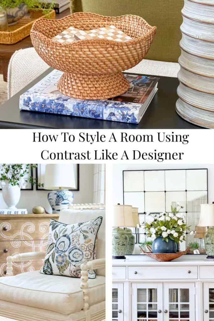
Happy Decorating, Friends!


Yvonne, This is my absolute favorite tool to use in my home and my art! Great article!
Thanks, Kat! Contrast is so important! It’s a great design element to learn and use.
Wow – your last few posts have been like a decorating tutorial. I love the contrast between rustic and refined. Your example of a silver punch bowl placed on a wooden cutting board is exactly what I did in my kitchen. I think it’s a real statement on our personalities – for example, a little bit country and a little bit rock and roll!
LOL! I got a kick out of your last sentence. You are so right Lyn!
Good Morning……..Thank You I am leaning and like the lady said a little bit country and I little bit rock and roll…..
LOVE that! So glad you are learning, Eva! We all are.
Yvonne, I love to use my phone to take pictures of my rooms to see what looks right and what looks wrong. Texture and repetition of shapes are two ways I like to make a room interesting. I also like to add a little black to my rooms and find it great with my neutral color scheme. Prayer coffee and your blog each morning start my day out right. Bless you.
LOVE your morning combination, Kathy! Thanks! And yes you are so right about your decorating tips.
Hi Yvonne,
I have learn so much from you! Thanks to you, I feel like my home has finally grown up!
I love your new mirror. It looks fantastic! What size did you order?
Hope you have a great day!
Linda
I ordered the largest size. I’m thrilled StoneGable is helping you! That is my goal.
I have lighter oak kitchen cabinets, but am interested in getting a darker(with hints of light in it) dining room table which is right next to the kitchen. Is that okay to do? It is a sort of contrast?
Contrast is a very good thing. Just watch the undertones of each piece of wood. They should not fight each other. See this helpful post:https://stonegableblog.com/can-you-mix-warm-and-cool-colors-in-decor/
I love your home! Where do you shop for curtains? ❤️
My favorite place to shop for curtains is Ballard Designs. They are pricy but they are gorgeous and so well made! Worth every penny.
I learned contrast this through trial and error. Now I know it’s an actual thing and has a name! I will look to do it more often. Thank you for your great tips and advice!
Good for you, Susan.
Thank you! I like the painting above the mantle— source, please? 😊
Hi Lu, this piece of art was a splurge and worth every penny! Here you go: https://on.ltk.com/+oIozSAdbAAIibc2lXYKo5w